The colours didn’t pass
The brand had only ever been printed. A print agency held the guidelines and on paper they worked. On screen the colours didn’t have enough contrast to read, and the typeface wasn’t built for it either.
Nobody asked me to look at this. I pushed for accessibility to be the standard, then we changed the colours and the type, and wrote guidelines for the web — not just what the brand looked like, but how to use it and keep it readable. After that, work came through me to check.
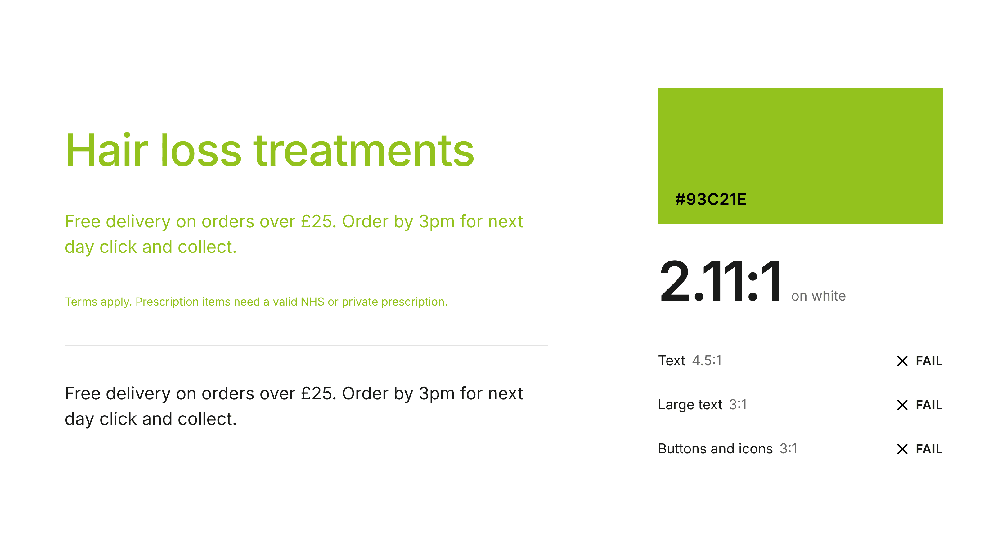
Lloyds Pharmacy · Colour
The old green on white: 2.11:1, failing every threshold.
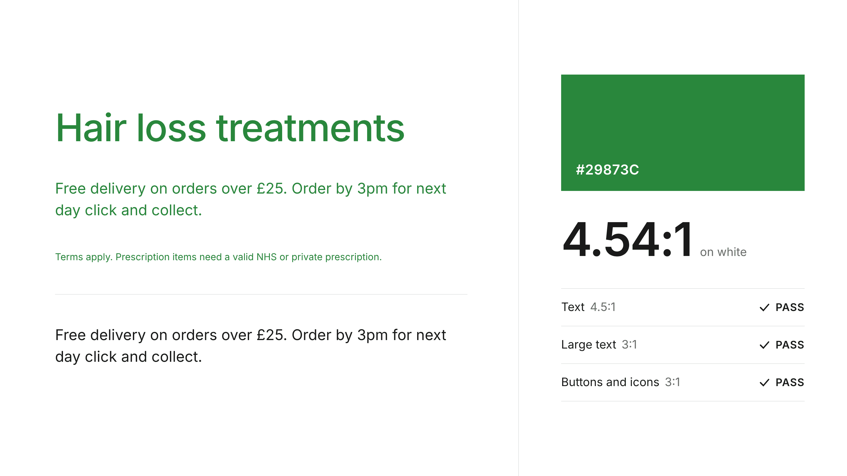
Lloyds Pharmacy · Colour
The new green on white: 4.54:1, passing every threshold.
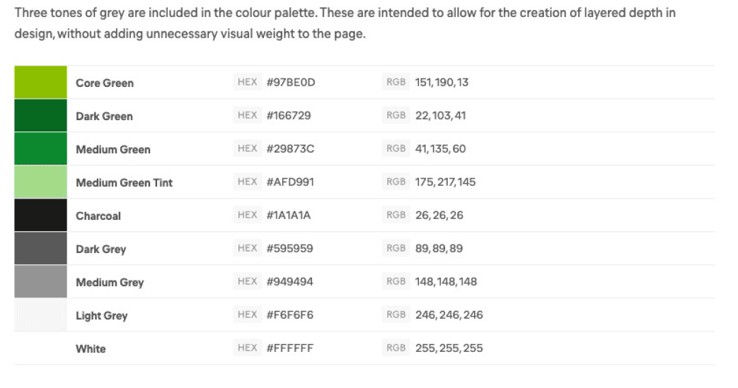
Lloyds Pharmacy · Palette
The palette that replaced it, with the greys for layered depth.
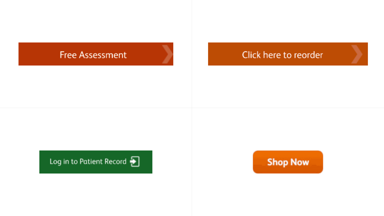
Lloyds Pharmacy · Before
Four buttons, four colours, shapes and treatments. Nothing in common.
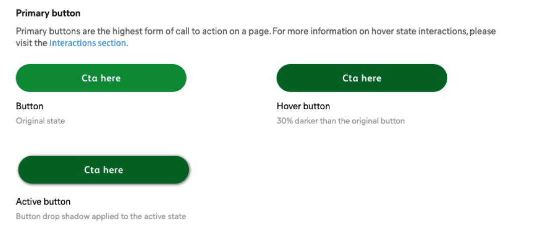
Lloyds Pharmacy · Buttons
One primary button, with its hover and active states written down.
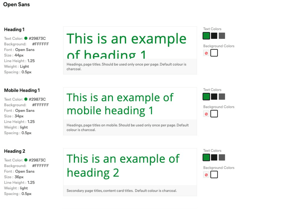
Lloyds Pharmacy · Type
Open Sans, with size, weight, spacing and permitted colours set out for each style.
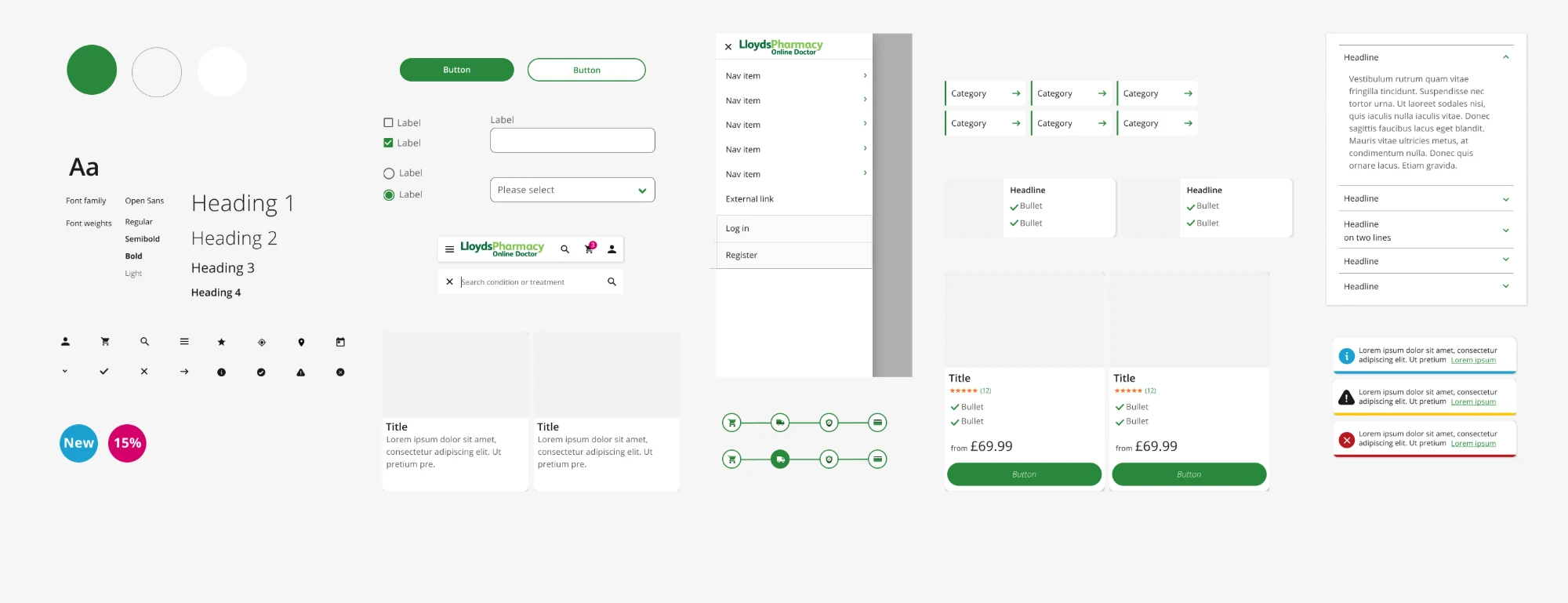
Lloyds Pharmacy · Web system
Colour, type and components, built for screens.
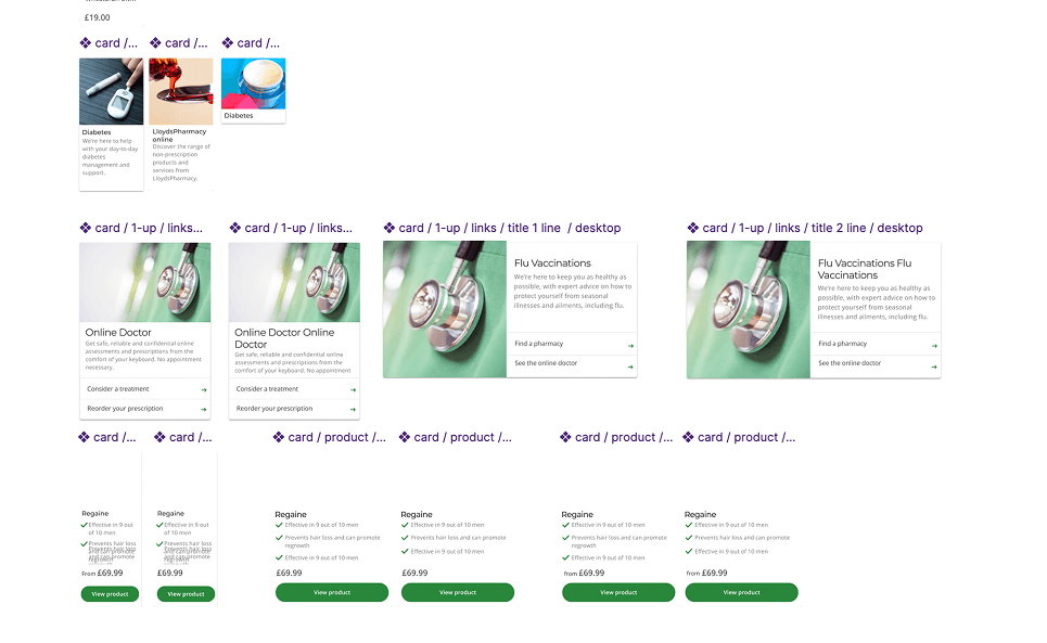
Lloyds Pharmacy · Components
Content and product cards, in their sizes and variants.
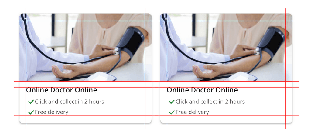
Lloyds Pharmacy · Card anatomy
The service card on a grid: image, title and benefits all aligned to the same edges.
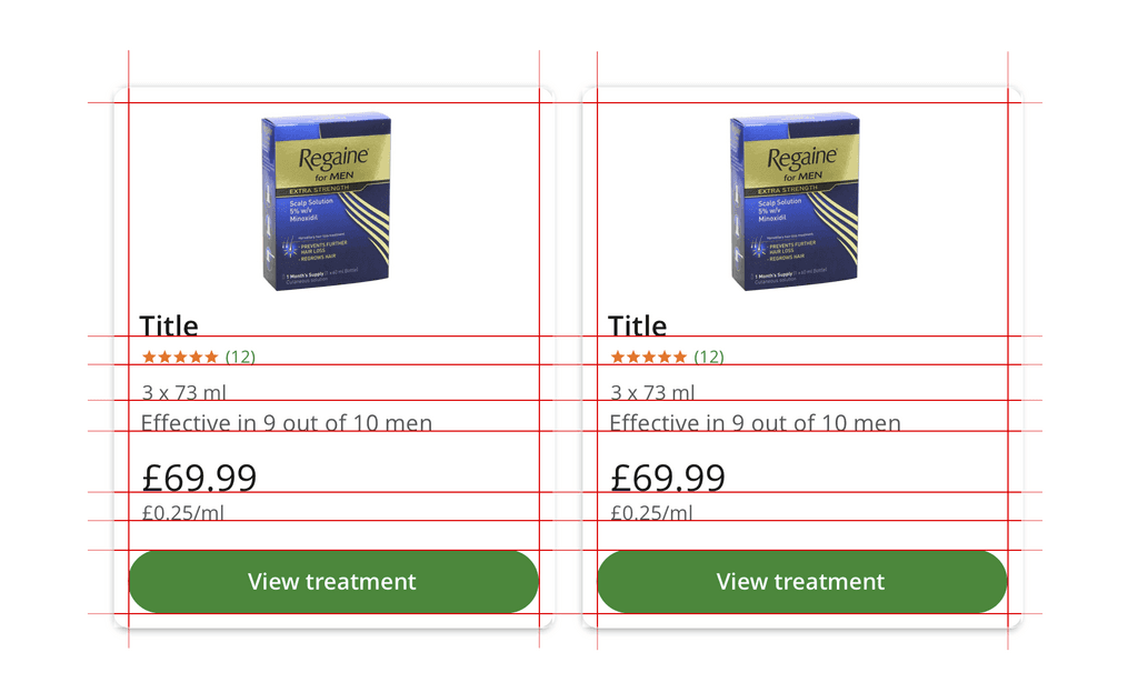
Lloyds Pharmacy · Card anatomy
The product card on a grid: every row sits in the same place from card to card.
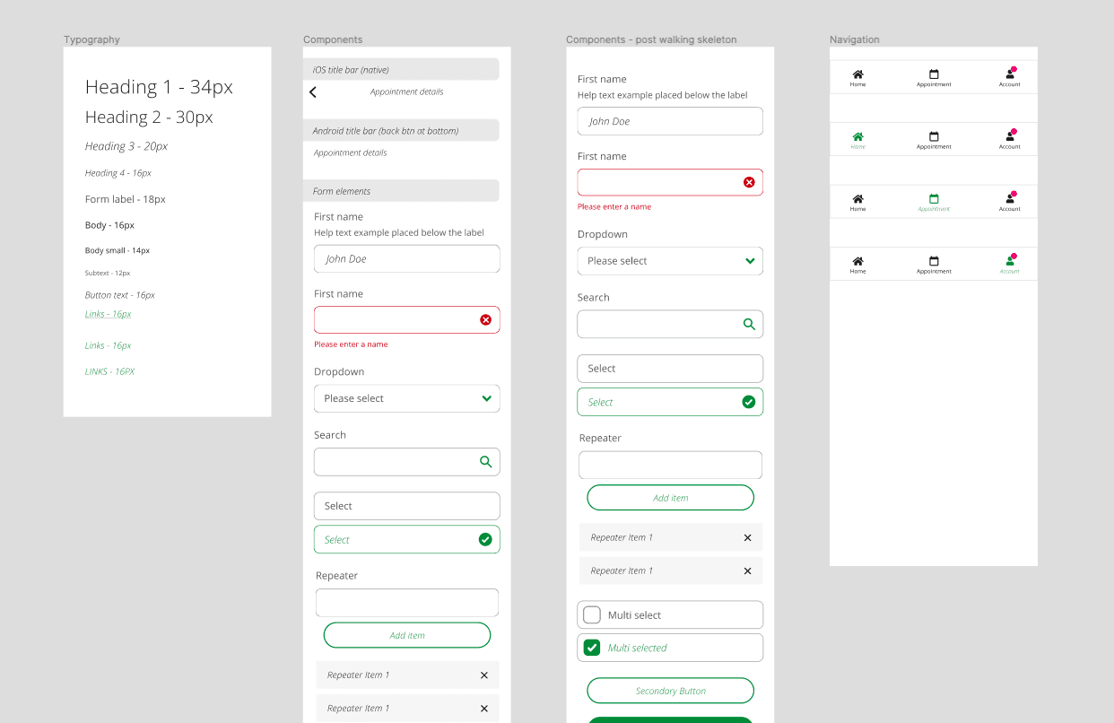
Lloyds Pharmacy · App system
Typography, components and navigation for the apps.
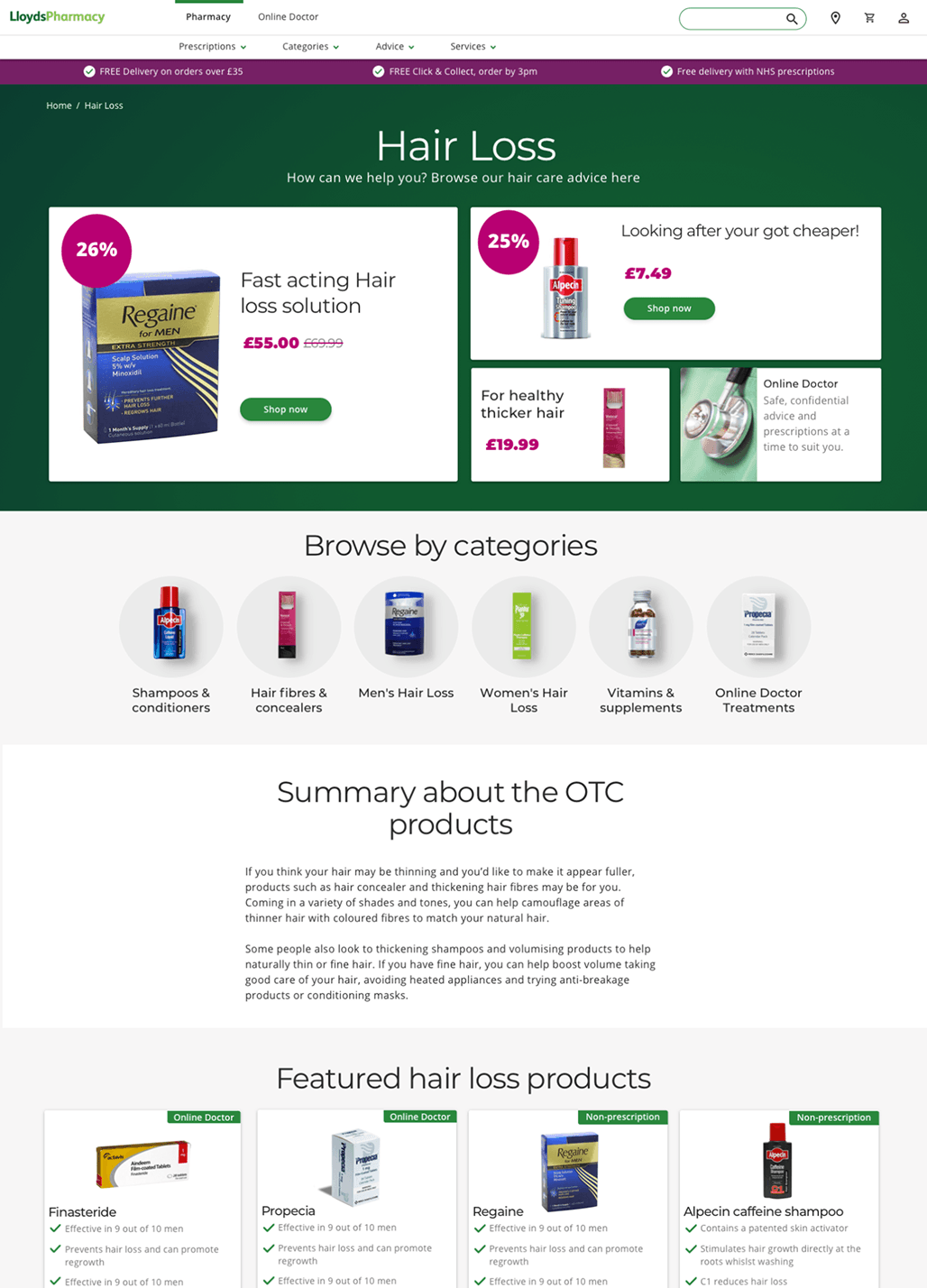
Lloyds Pharmacy · In use
The system applied to the pharmacy site.
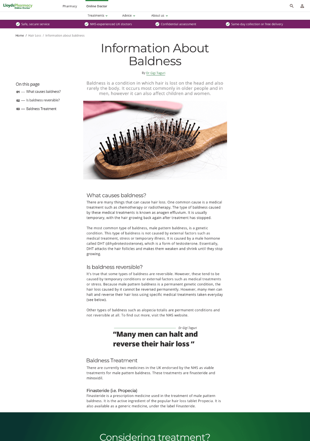
Lloyds Pharmacy · In use
And to Online Doctor: same header, type and components, so the two read as one.