MORE WORK . HEALTHCARE . 2022

Medicspot

Medicspot sold Covid tests you take at home.

I worked on how people found and bought a test, and on what happens after the kit arrives: registering it, taking it, and reporting the result. Everything was changing fast, so the work had to keep up.

The product.

Finding a test, buying it, and everything after

How people found and bought a test, and what happened once the kit arrived: registering it, taking it, and reporting the result.
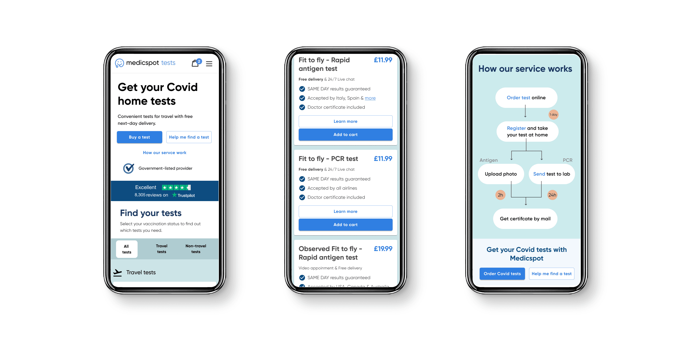
Three mobile screens: the Covid home tests homepage, a list of travel tests with prices, and a How our service works diagram
Where it ended up. Find a test, see what you get, and one picture of how the whole thing works.
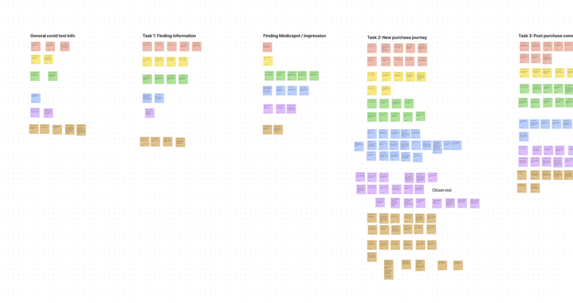
Board of sticky notes grouped by task: general Covid test info, finding information, finding Medicspot, the new purchase journey, and post-purchase communication
We watched people find a test, buy one, and deal with what came after. Everything they said went up on a board.
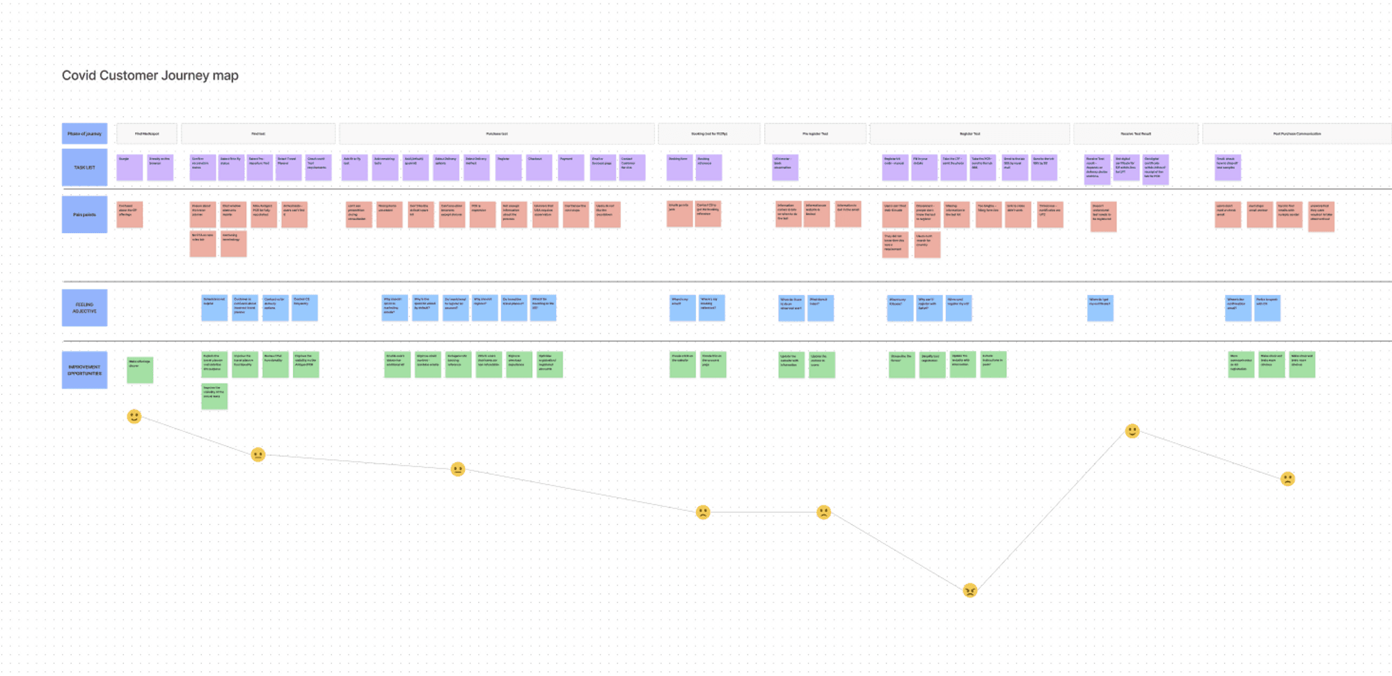
Customer journey map with phases, tasks, pain points, feelings and improvement opportunities, and an emotion line that dips in the middle
Then the whole journey in one map, from finding us to getting the result. The line at the bottom is how people felt. It drops right where they register the kit.
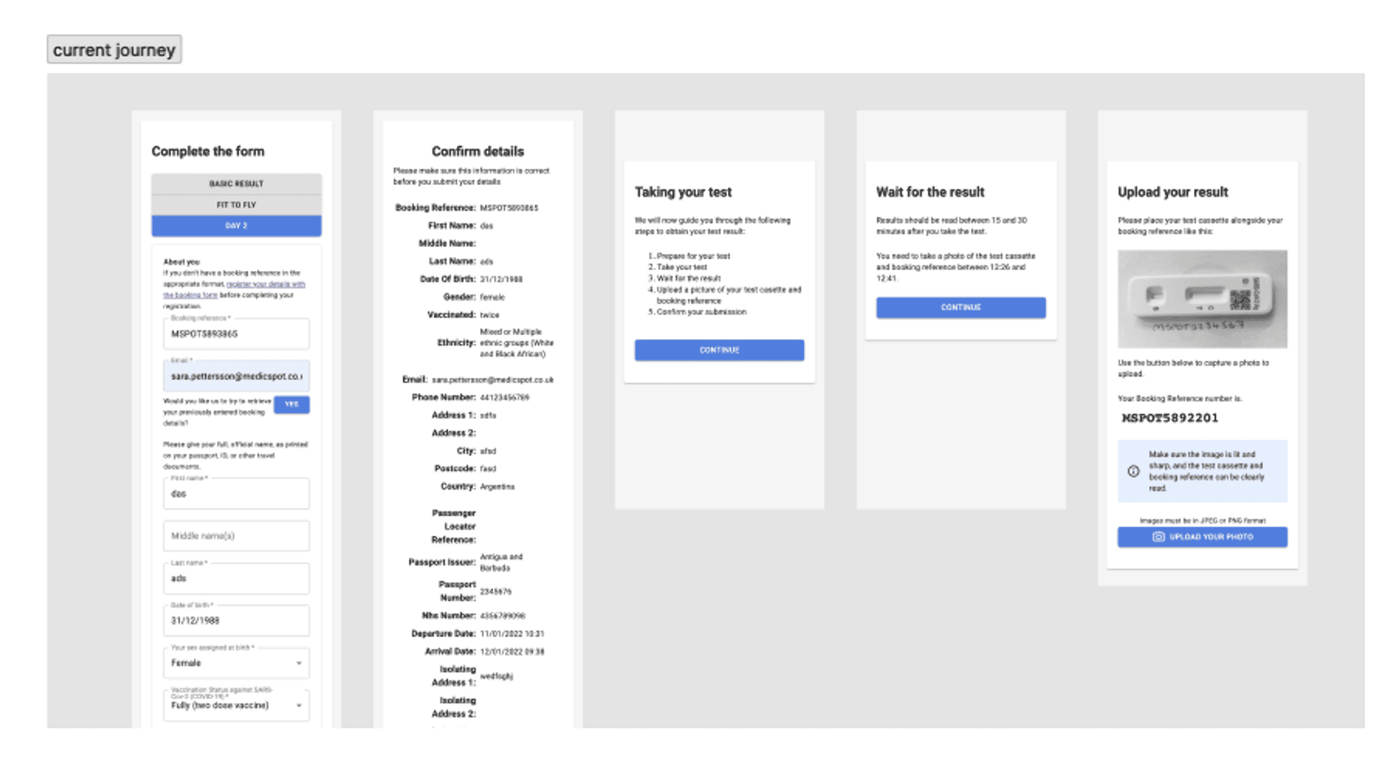
The old registration journey: a long form, a confirm details page, a list of instructions, a wait screen and an upload page
This was the worst part. A long form, a page of instructions to remember, and then a photo of your test to upload. People got stuck here and called us.
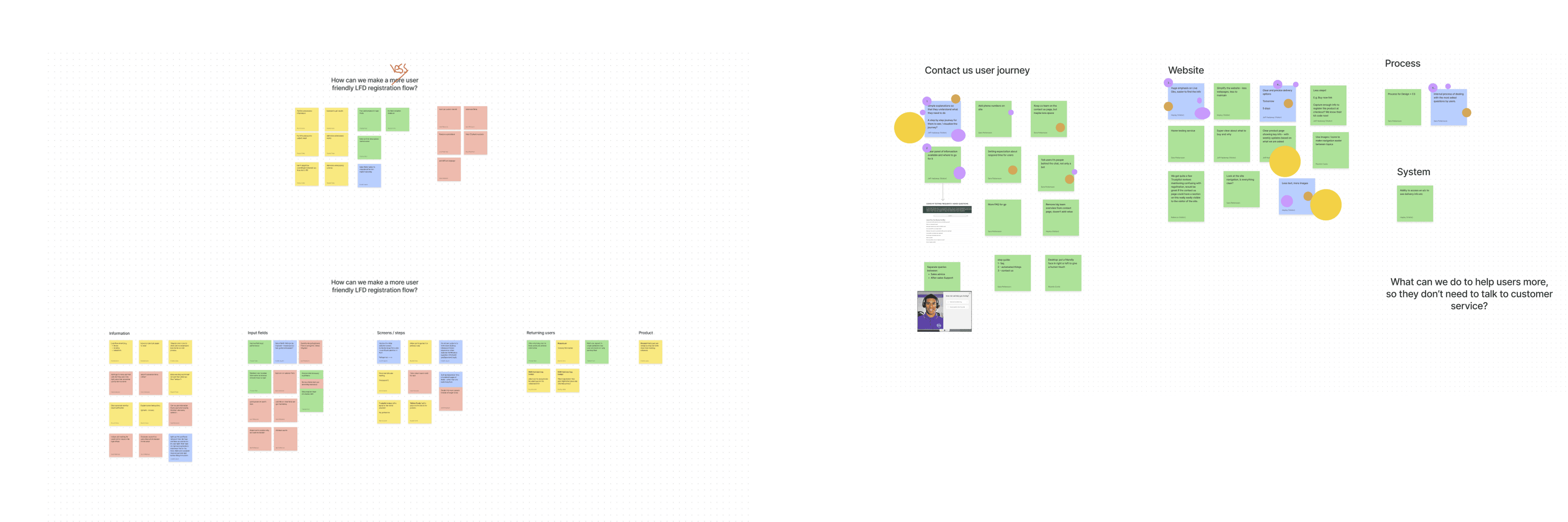
Two workshop boards of sticky notes, one on a friendlier registration flow and one on the contact us journey, website, process and system
Two questions we kept coming back to: how do we make registering a kit easier, and what can we fix so people don't have to ring customer service at all.
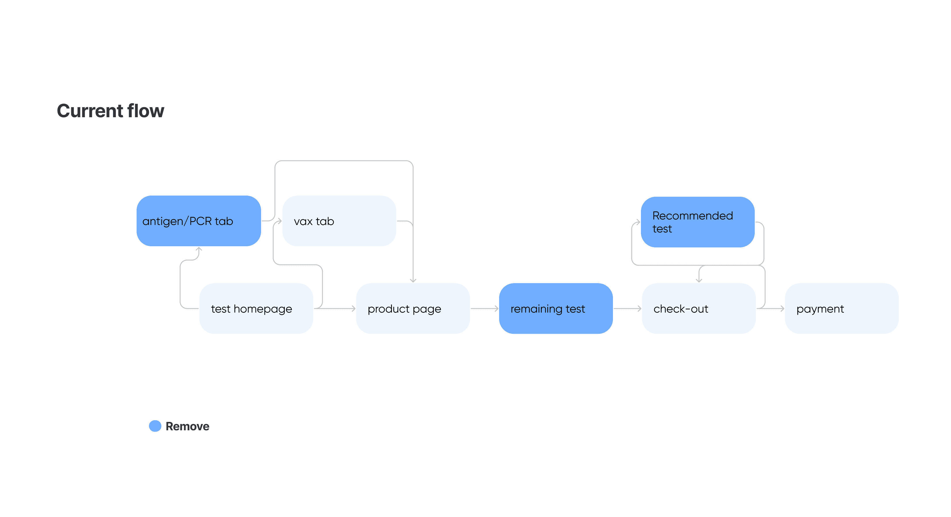
Flow diagram of the old purchase journey with tabs, product page, remaining test and recommended test steps marked for removal
Buying a test meant going through tabs, a product page and a recommended test before you got anywhere near paying. The blue boxes are what we took out.
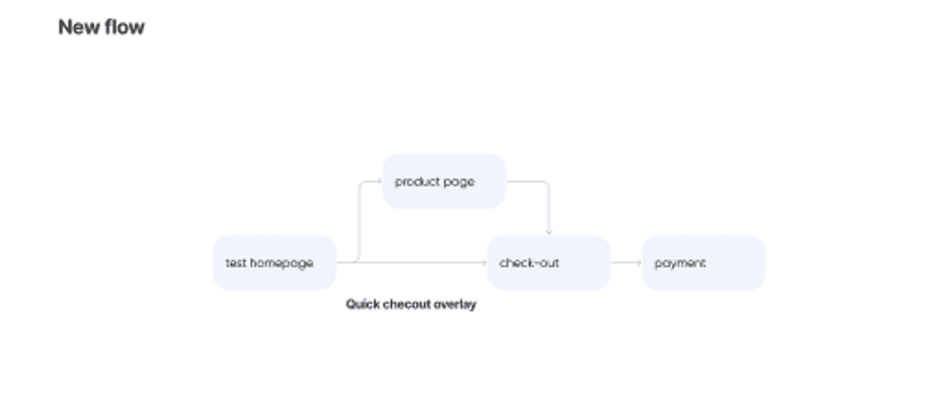
Flow diagram of the new purchase journey: test homepage to checkout to payment, with the product page as an optional step
What was left. You can still open the product page if you want to read more, or add to cart and go.
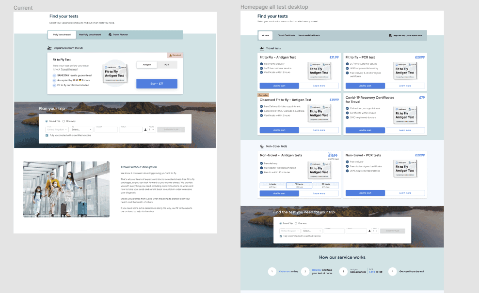
The old find your tests section with vaccination status tabs beside the new one showing all tests as cards with prices
Before, you had to say if you were vaccinated before you could see anything. Now the tests are just there, with the price and what each one is for.
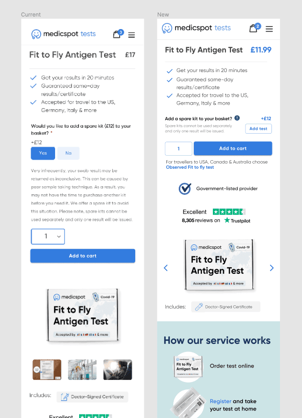
The old product page beside the new one, with a shorter list and an add a spare kit option
Same test, less to read. The spare kit question became a small add-on instead of something you had to answer first.
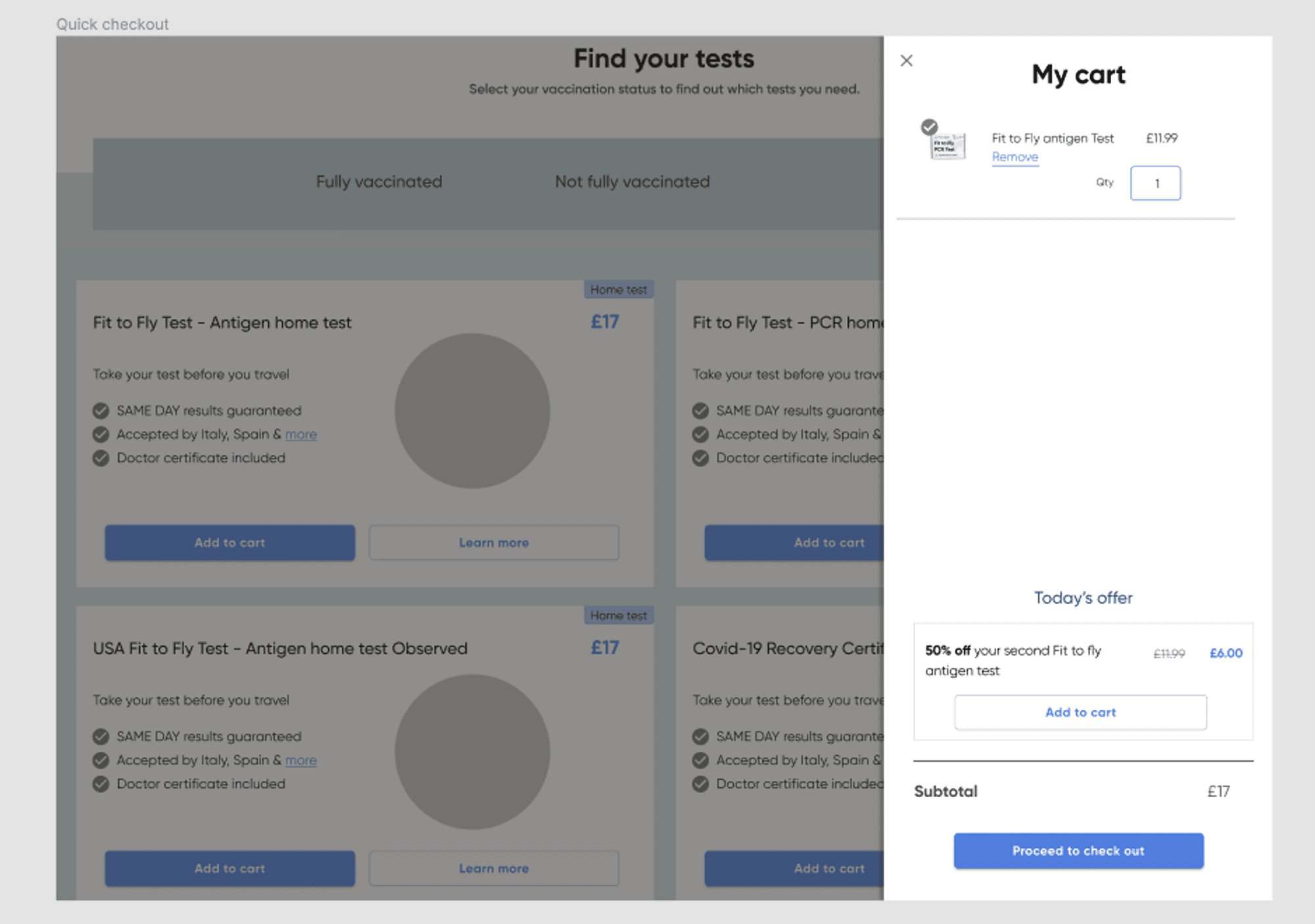
A cart panel sliding over the test list, showing the chosen test, an offer and a proceed to checkout button
And you never really leave the page. The cart slides over, shows what you picked, and you carry on.
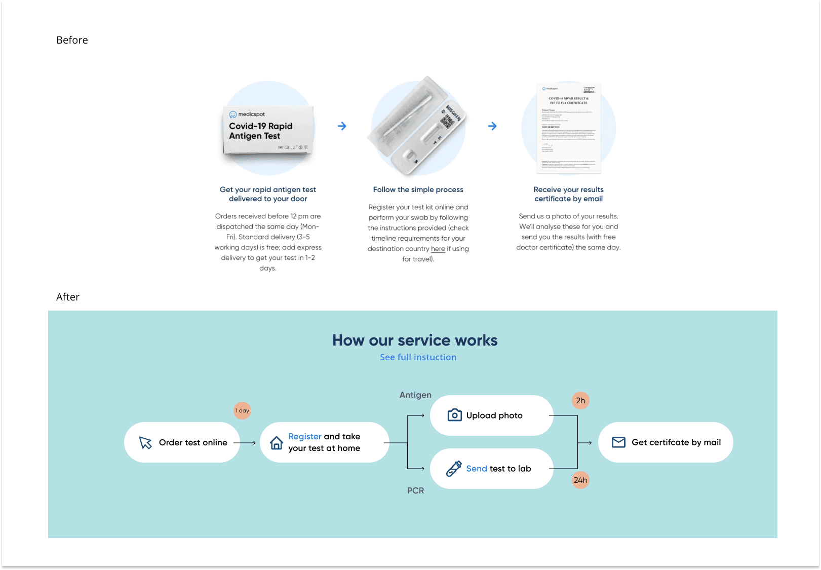
The old three-column explanation above the new diagram showing order, register, upload photo or send to lab, and get certificate, with timings
The old version was three blocks of text. The new one is a picture, and it tells you how long each bit takes.
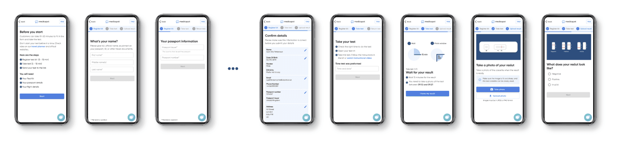
The new registration flow on mobile: before you start, name, passport, confirm details, take your test, a timer, take a photo, and what does your result look like
One thing per screen, a bar so you know where you are, and a timer for the wait. At the end it shows you what a positive, negative and invalid test look like, and asks which one you have.
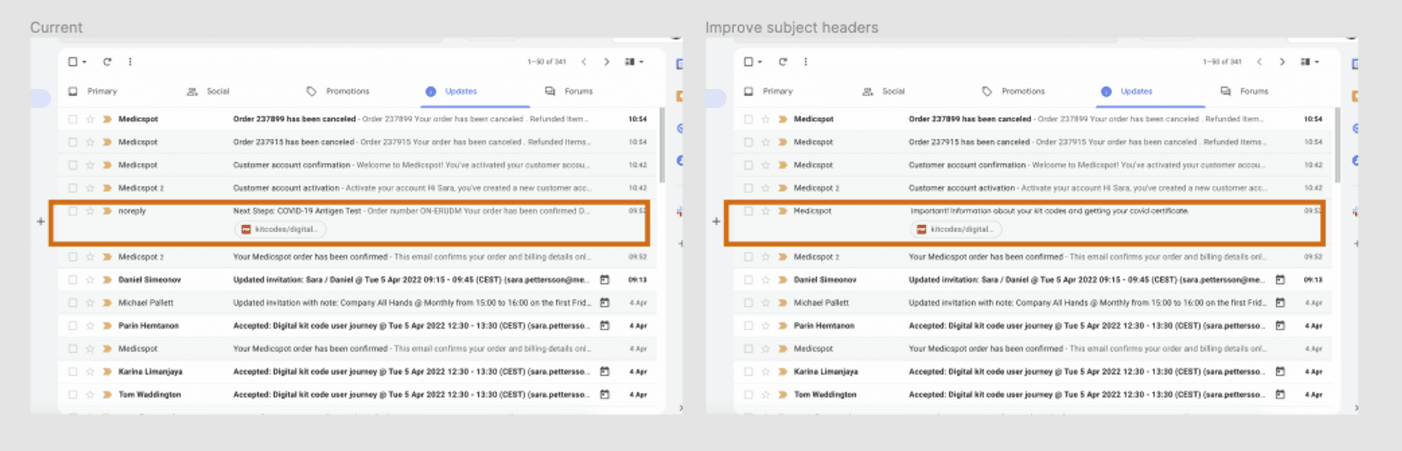
An inbox showing the old email from noreply with an order number subject beside the new one from Medicspot about kit codes and the Covid certificate
A small one I like. The email with your kit codes came from “noreply” with an order number as the subject, so nobody opened it.
The system.

A system nobody had written down

They already had MUI, but nobody had agreed how to use it. So I found every button in the product and put them side by side. Ten things were drifting — colour, weight, padding, radius, case, even the wording. Then I mapped 111 screens to the components they actually used, and wrote the rules.
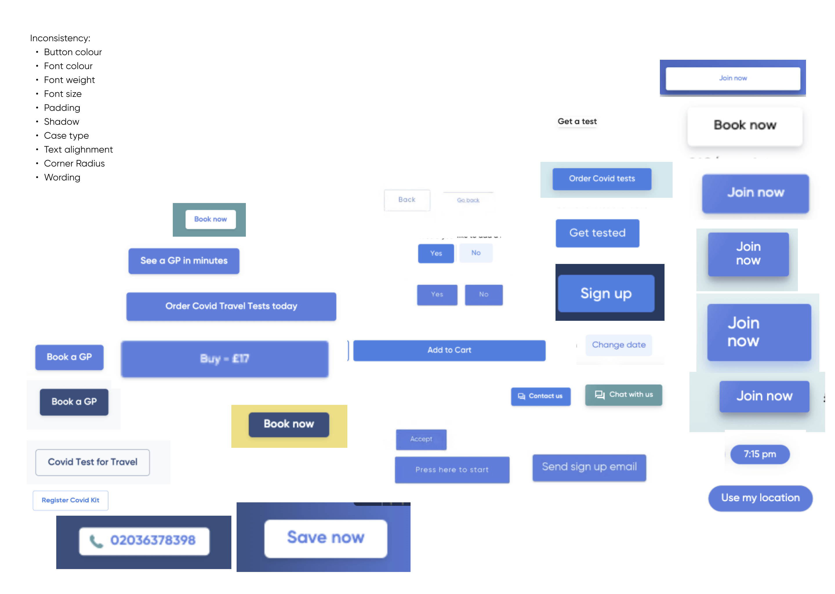
Every button in the product laid out together: dozens of variants in different blues, greens and yellows, some filled, some outlined, with different corner radii, shadows, padding and wording. A list beside them names the ten inconsistencies, from button colour and font weight to case type and wording.

Medicspot · Audit

Every button in the product, next to each other.
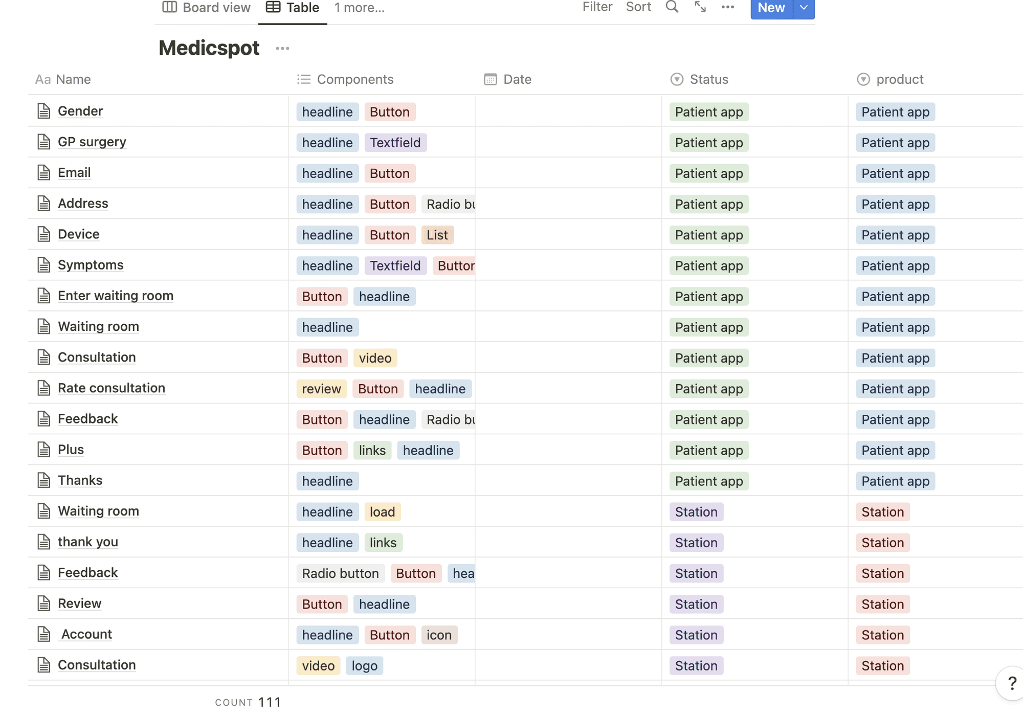
A database table listing Medicspot screens — Gender, GP surgery, Email, Address, Symptoms, Waiting room and on — each tagged with the components it uses, such as headline, button, textfield and radio button, and with the product it belongs to. The count at the foot reads 111.

Medicspot · Inventory

111 screens, mapped to the components they used.
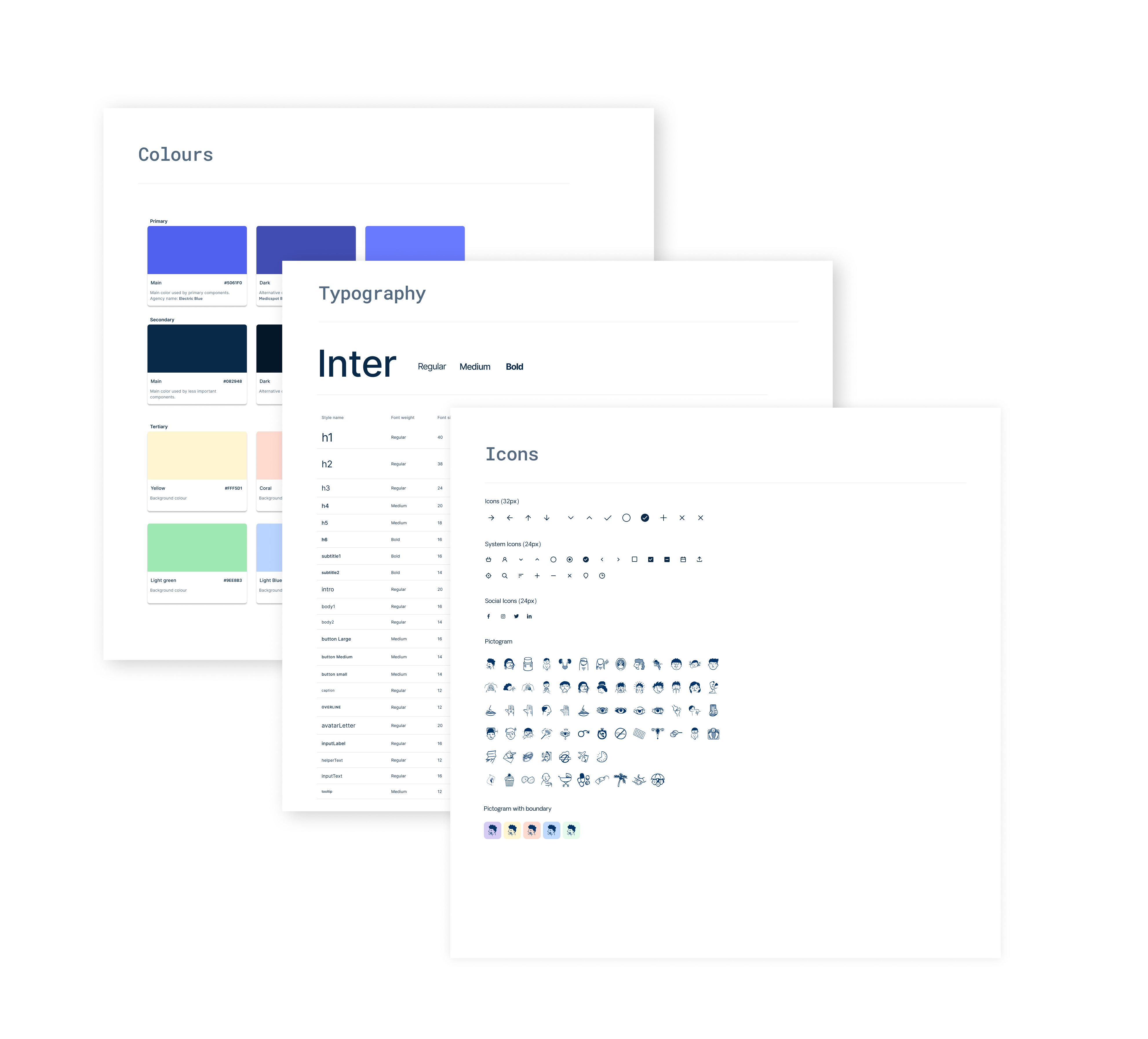
Three overlapping foundation sheets. Colours sets out primary, secondary and tertiary swatches with hex values and a note on where each is used; Typography shows Inter in regular, medium and bold with a table of styles; Icons shows the 32px and 24px sets, social icons and a grid of pictograms.

Medicspot · Foundations

Colour, type and icons, with rules for using them.