DESIGN SYSTEMS . MULTI-CLIENT PRODUCTS
Designing one system for many products, brands and clients
We were building products for two of our internal brands and a growing number of external clients.
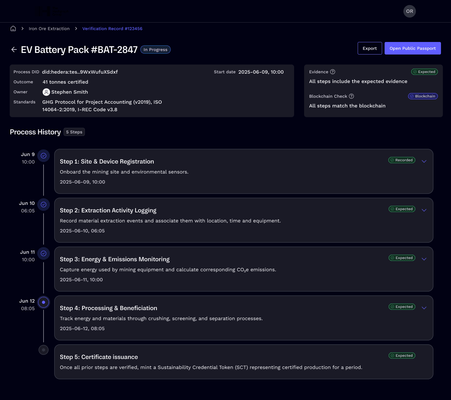
The products looked different, but underneath, they were largely the same: tables, forms, navigation, dashboards, and common workflows.
We had no shared system, so we were constantly re-solving those problems.
I found out that we already had the beginnings of a design system, but it was outdated and barely used. I evolved that foundation into a flexible multi-brand system, separating what should stay consistent from what needed to change across clients, themes and screen sizes.
- ROLE.
- Lead Product Designer
- FOCUS.
- Design systems · Product architecture · Multi-brand UX · Design engineering
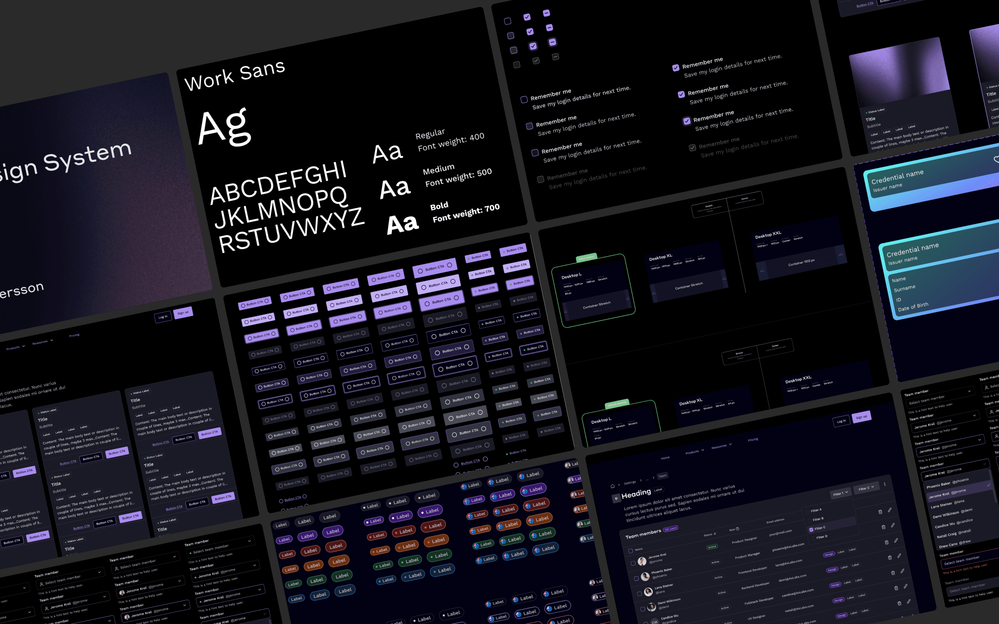
Every new product started too close to zero
Many of the clients had no design system at all. That meant each new project required the foundations, components and patterns before we could really get on with the product itself.
The same problems were being solved over and over again. A table built for one product would be reworked for another. Navigation patterns developed in isolation. Developers would simply implement a variation of a UI that already existed elsewhere.
The issue wasn’t just duplicated effort. Similar interactions were also starting to behave differently across products. We needed a shared foundation, not a traditional single brand system.
It had to support multiple brands, multiple client products, light and dark themes, responsive layouts, and product-specific requirements.
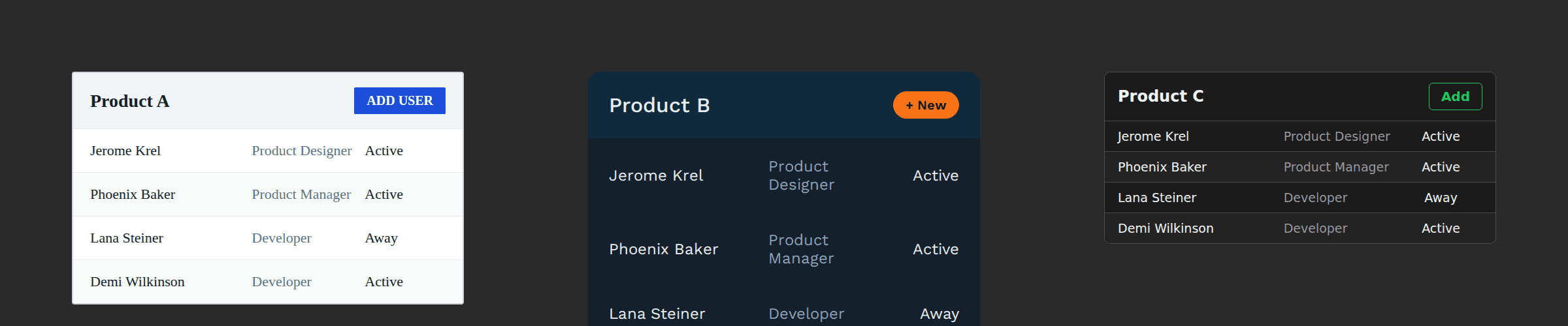
What should be shared and what should be flexible?
This was the key design issue with the system.
Some things should stay consistent
- interaction behaviour
- accessibility
- component structure
- hierarchy
- common UX patterns
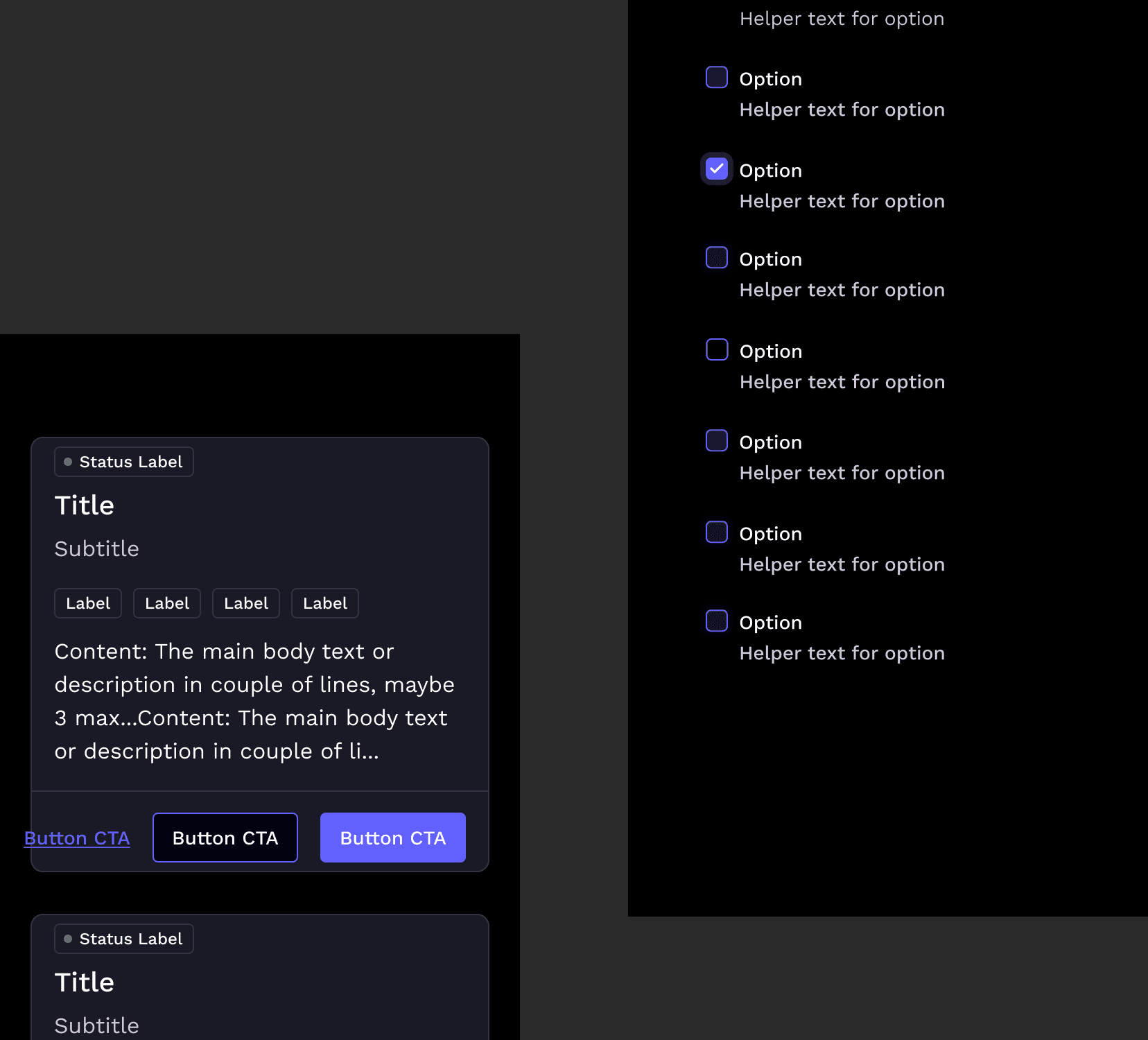
- states such as empty, loading, error and validation
Other things needed room to change
- colour
- typography
- radius
- theme
- certain product-specific behaviours
Not every difference between the products required a new component or variant.
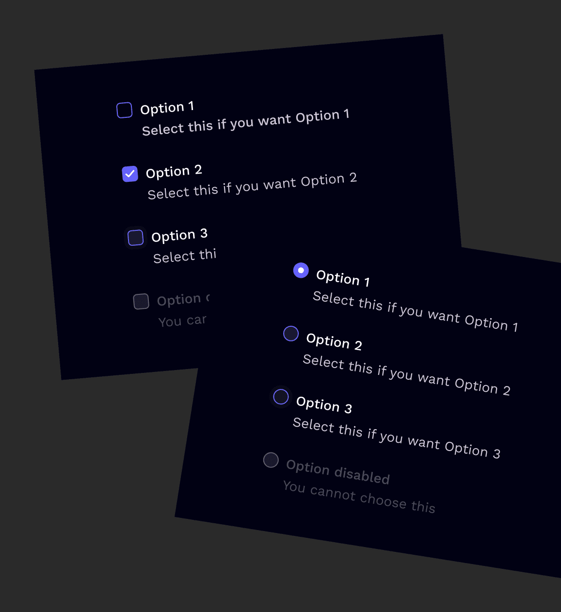
We started thinking about differences in three ways
Shared pattern
Something we thought we’d solve once and then reuse.
Configurable behaviour
Something that should vary based on variables or component options.
Product-specific need
Something that should stay completely outside the system.
That helped us keep the system flexible without having every exception become part of it.
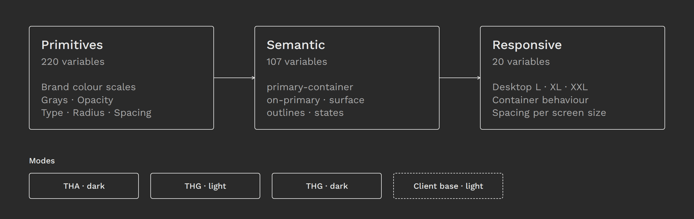
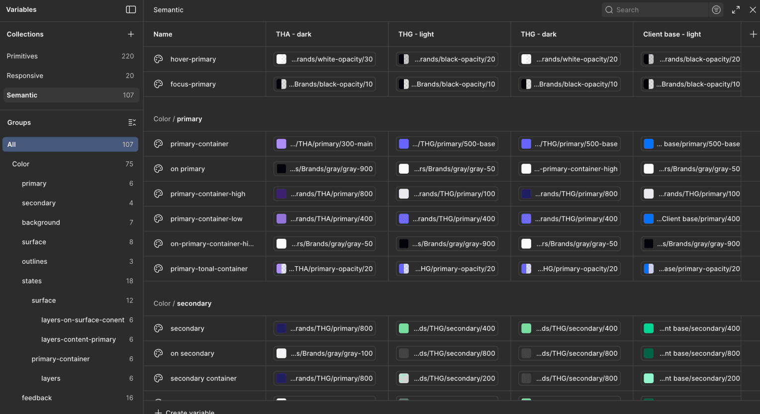
Reusing decisions, not just components
Once the system was mature the biggest value wasn’t just that we could design faster. We’d already agreed on how many common UI problems should work. We didn’t need to re-invent the wheel in terms of component states, empty states, validation patterns and interaction patterns for each new product.
Designers and engineers could start with patterns we already understood and focus on what was actually different. A screen or flow built for one product could frequently become the basis for another. The prior work had been isolated in individual projects and then started to form part of a shared product foundation.
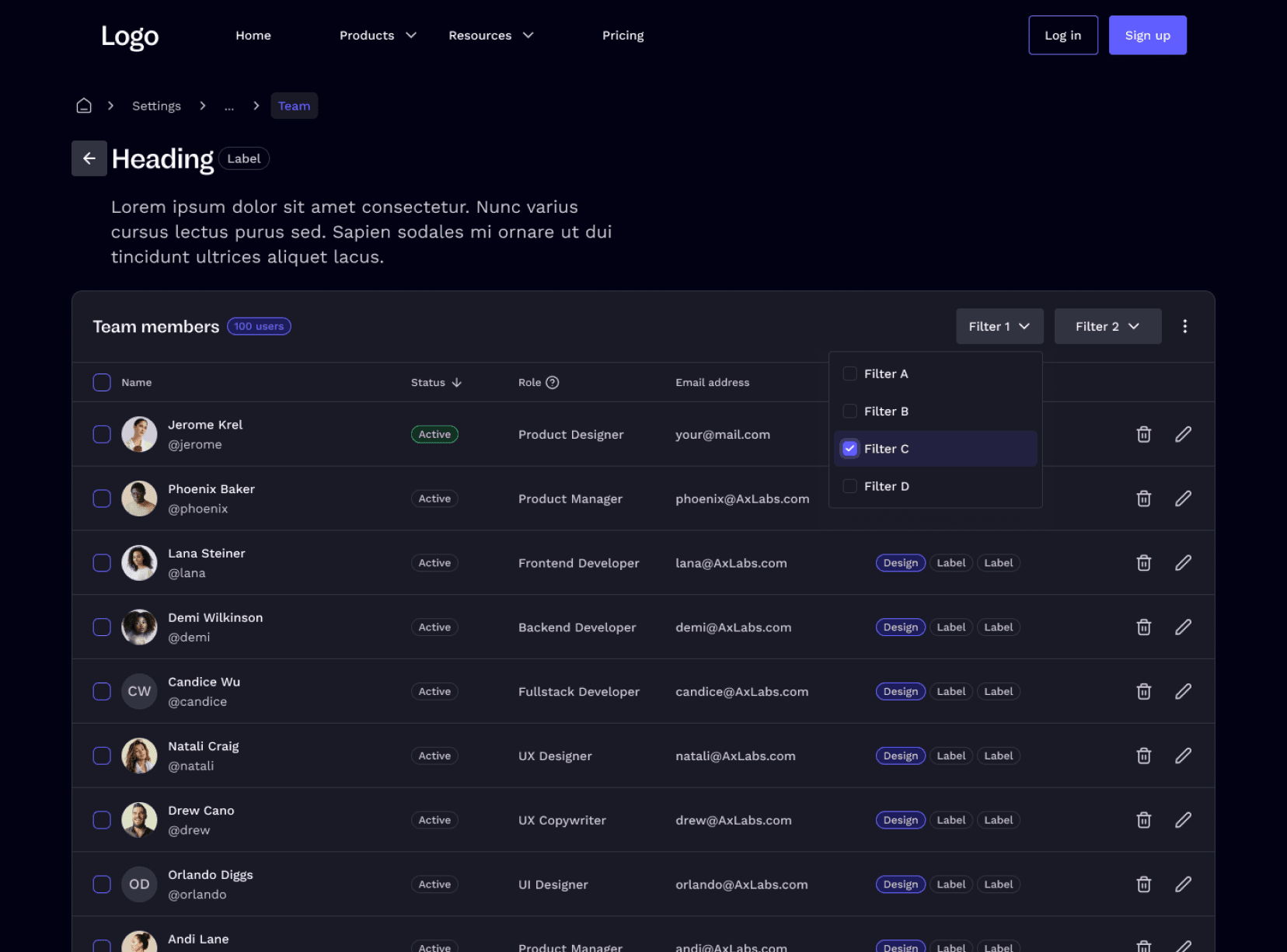
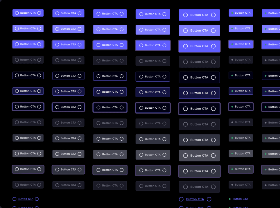
One foundation, different expressions
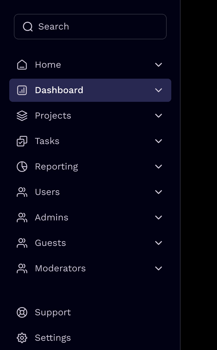
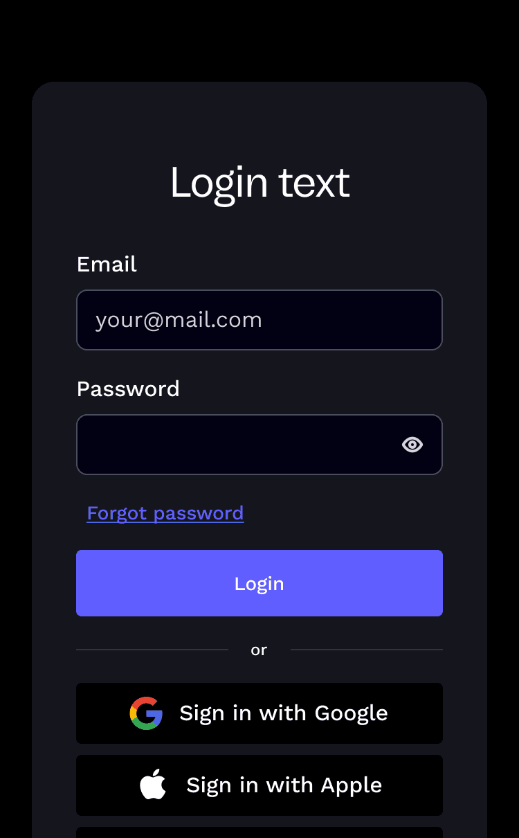
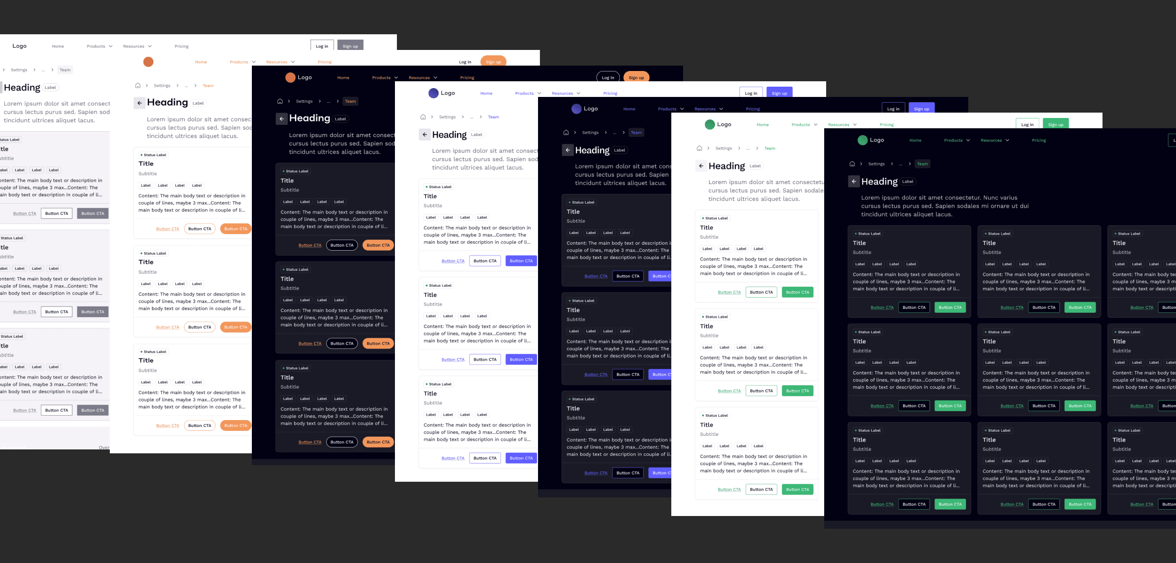
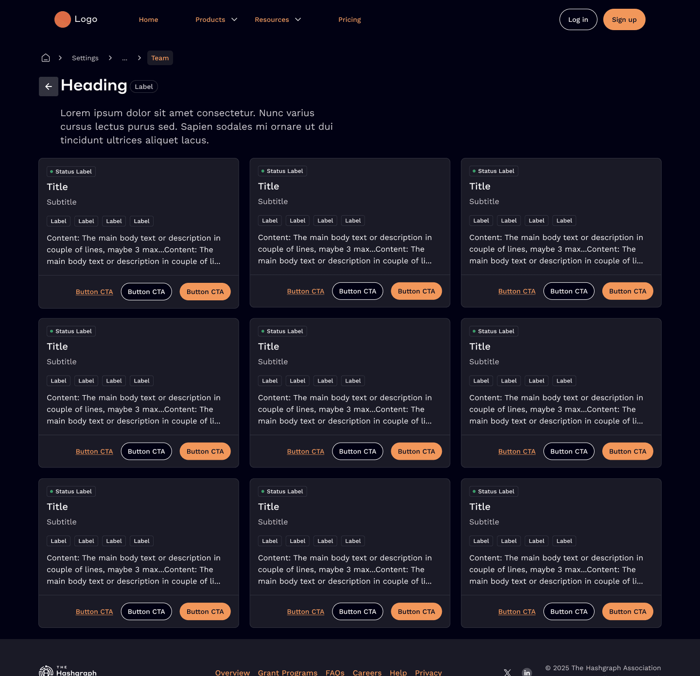
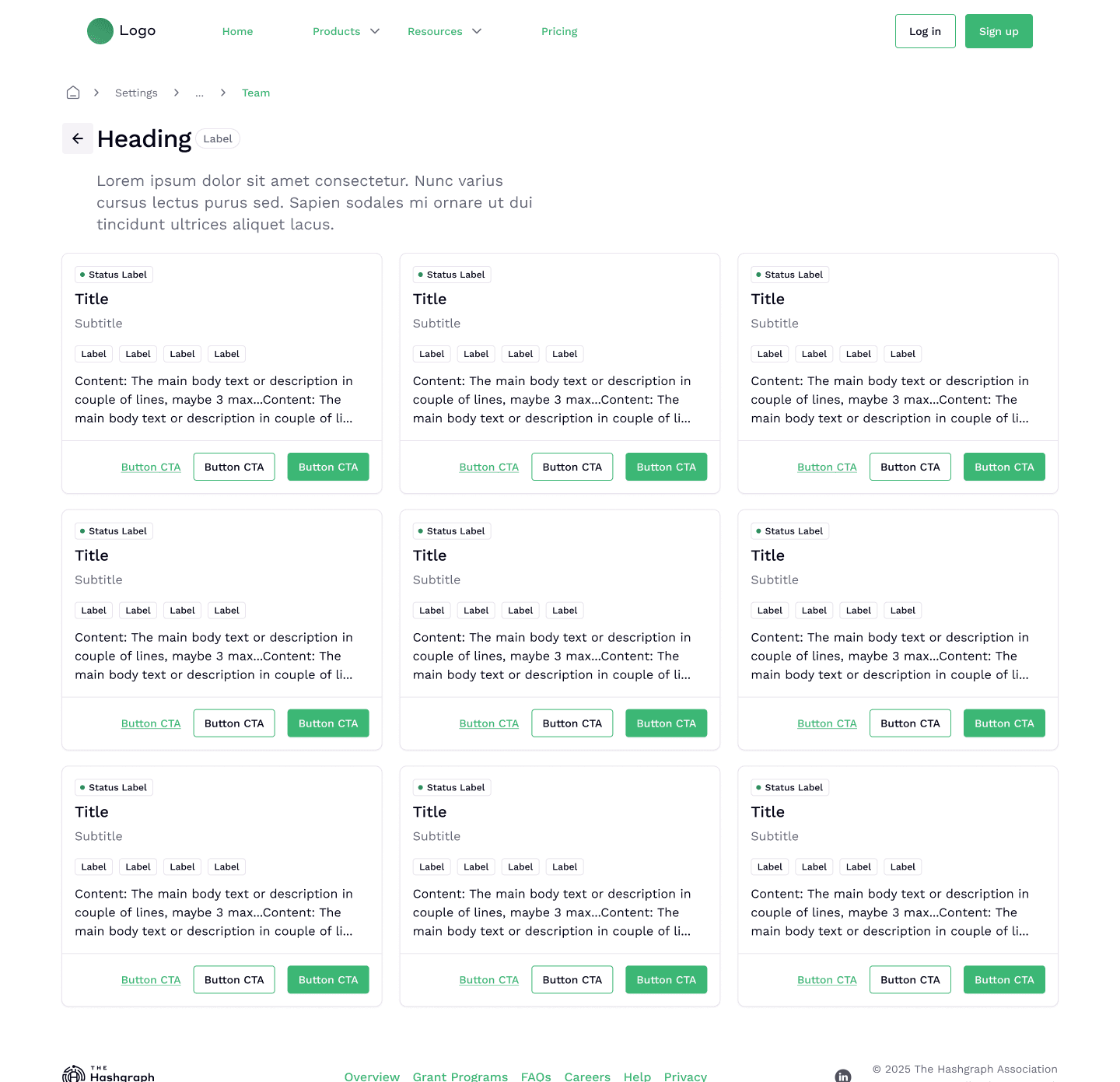
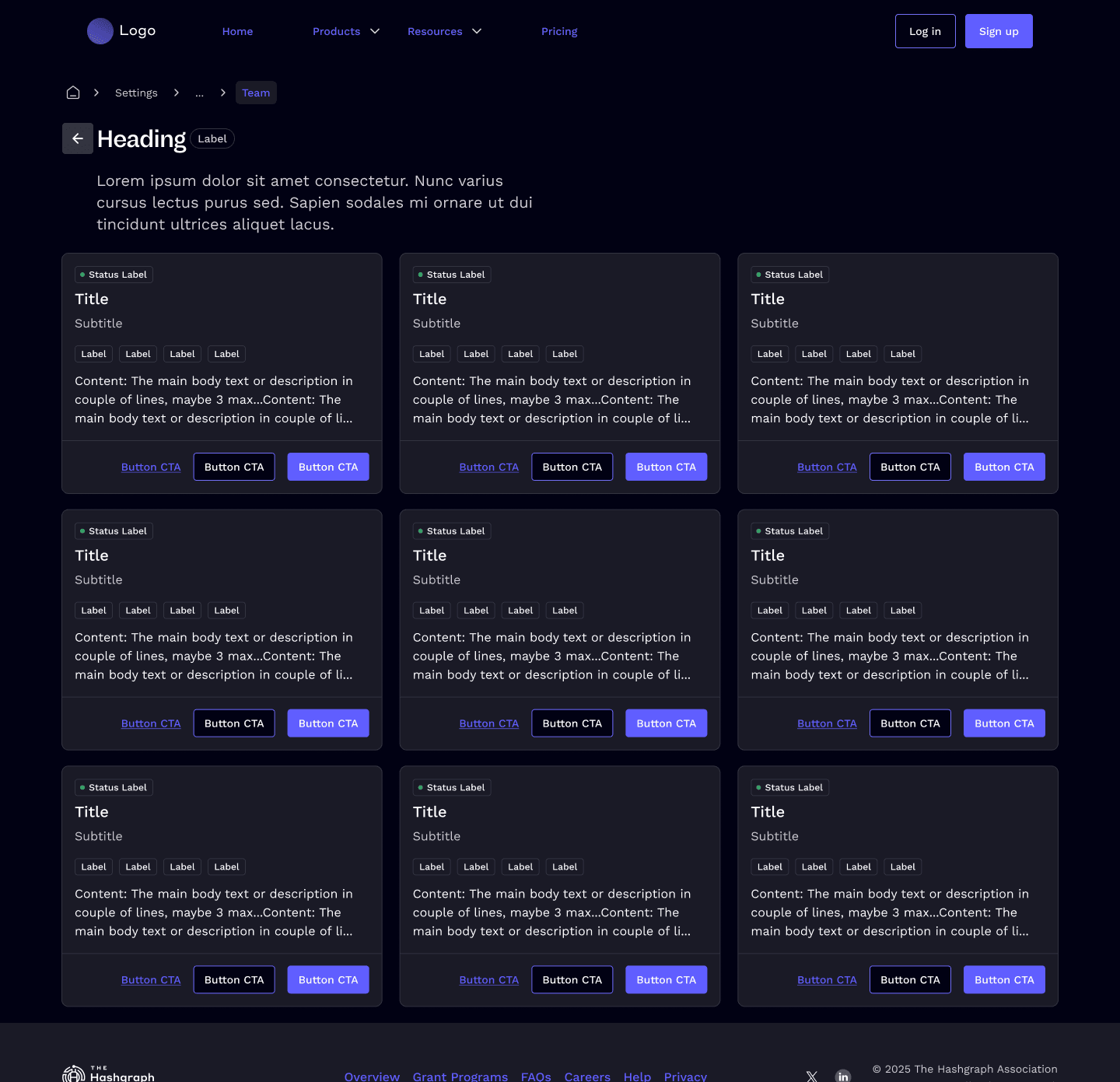
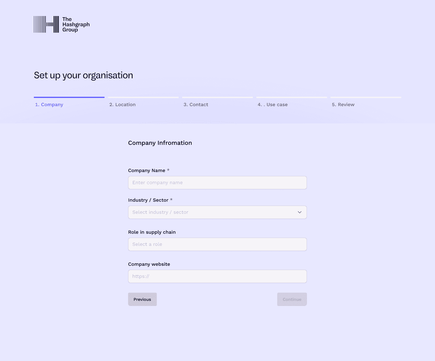
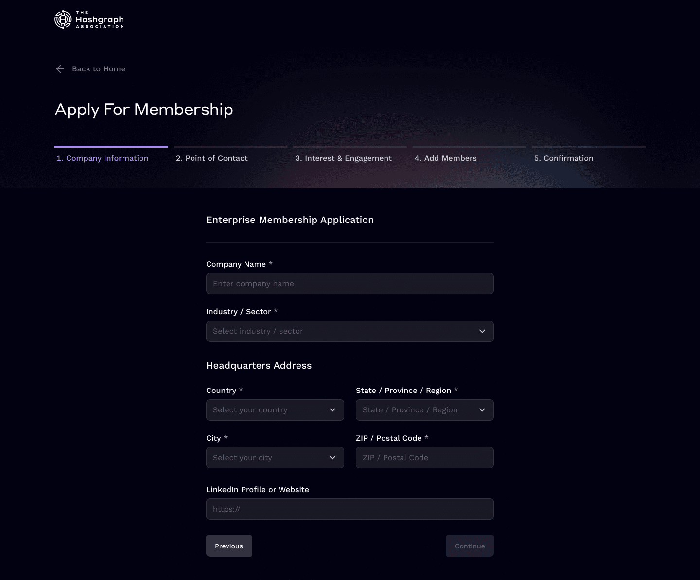
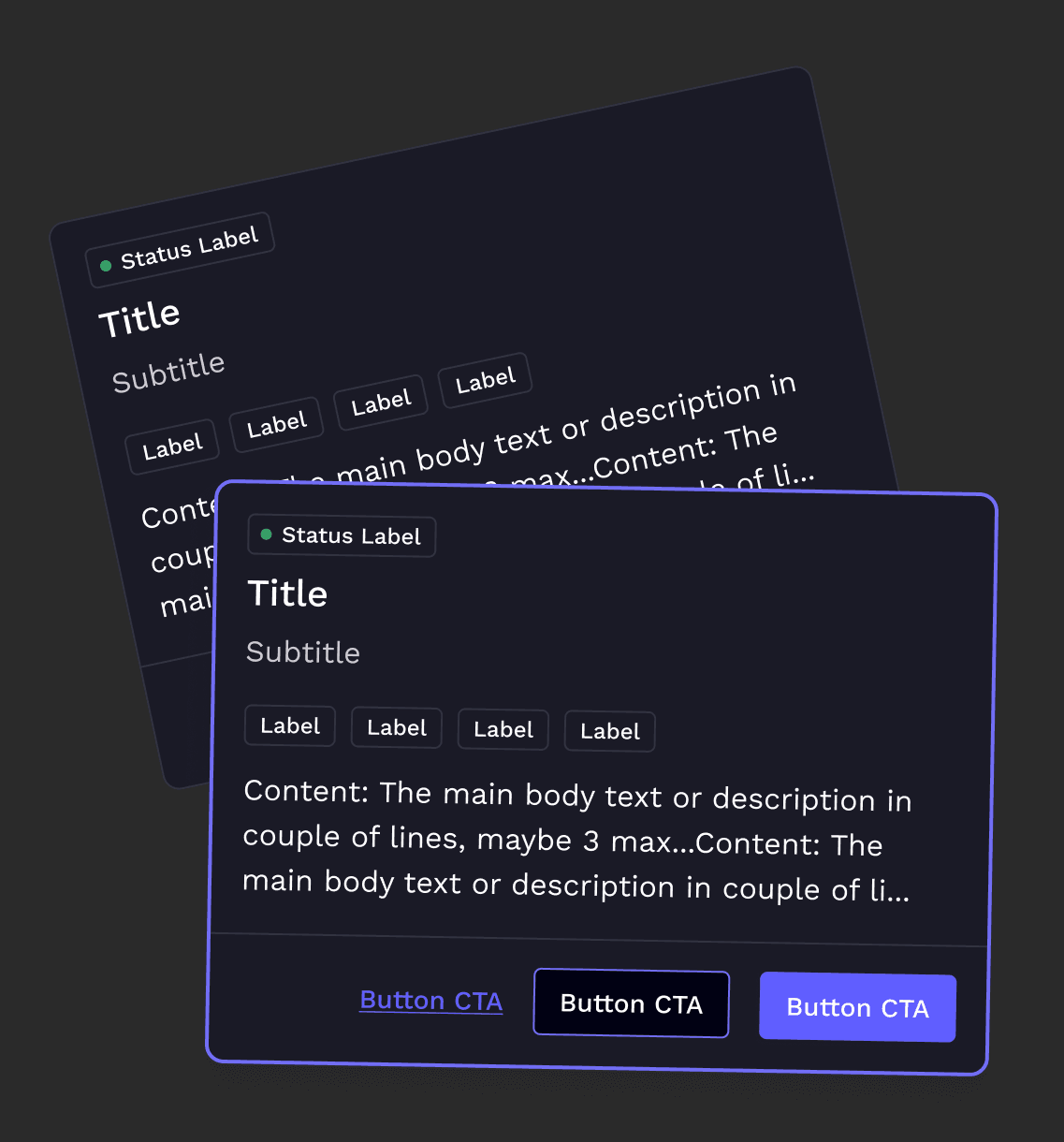
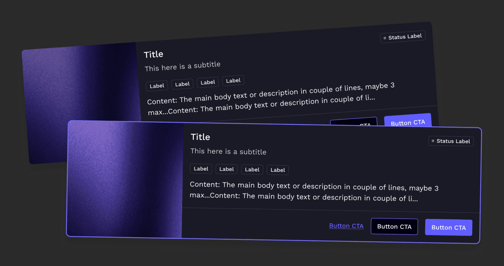
The same underlying components could underpin different visual identities. That meant a part didn’t need rebuilding as the customer had a different brand. The structure and behaviour could remain shared whilst the visual expression was allowed to change around it.
We had to think about colour and hierarchy in a semantic rather than a value based way so that the same component could move between themes and brands without breaking the contrast, states or readability.
A shared way of working with engineering
The system also changed the way design and engineering worked. Because the common components and states were already defined, we didn’t need to revisit and re-negotiate the same implementation details in every project. Design didn’t need to specify every empty state or interaction pattern from the ground up. Engineering didn’t need to re-interpret them each time. That gave us more room to go over the bits that actually required thought.
When a new product exposed a limitation in an existing component, we worked together to decide whether it was:
- a one-off requirement
- a configurable variation
- or something that should improve the shared system
We connected the Figma system to the reusable components in Storybook and ran the work through a shared Jira backlog.
The design system became shared product infrastructure rather than just a Figma library.
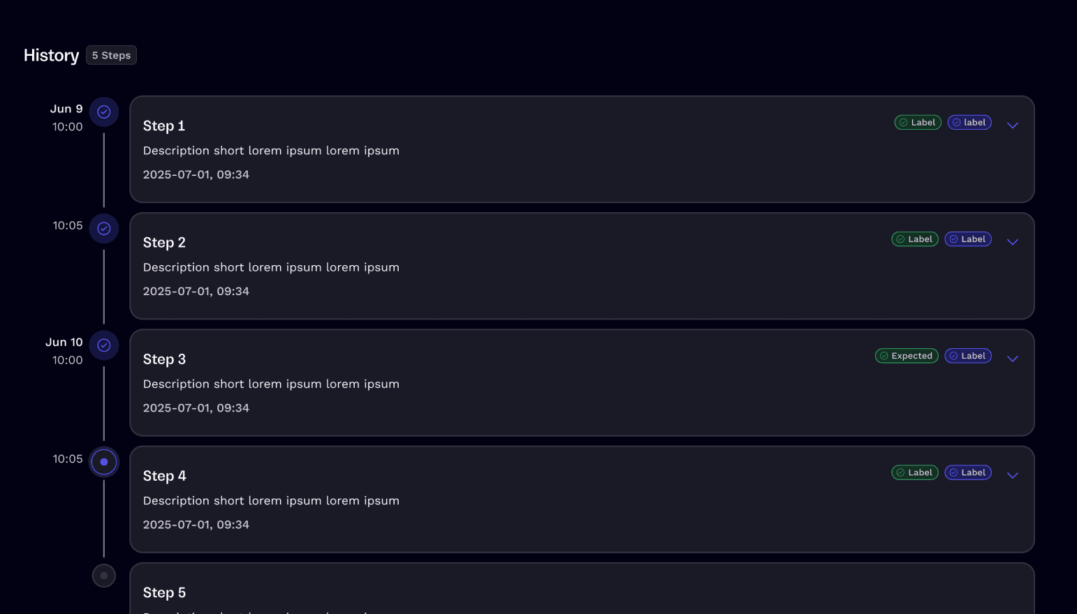
We never tried to complete the whole system before teams could use it.
It began with the patterns that our products needed most. As new projects revealed our gaps, we improved the existing bits and fed them back into the system.
Each new product could stand to benefit from what we’d learned in the previous ones. That was one of the most significant shifts. The system wasn’t static, it got better with use.
What changed
New projects stopped starting from zero
Teams could start off with existing components, patterns and screens.
We stopped redefining common states
Empty states, validation, loading and the recurring pattern all had a common approach.
Product work became reusable across clients
Solutions from one project can form the basis for solutions in another.
Brand differences stopped requiring separate systems
Variables took care of most of the visual variation, the underlying UX was shared.
Design and engineering had a common language
Both disciplines were working from the same components, behaviours and states.
New products improved the system
Real product work did expose the gaps and was instrumental in shaping and evolving the shared foundation.
What I took from it
What mattered more was creating a shared way for design and engineering to work. When common patterns, states and behaviours were already defined, we did not have to revisit the same decisions in every project. Designers could focus more on the product problem, and engineers had a clearer understanding of how components were expected to behave.
It also made the details more consistent. Empty states, validation, interaction states and responsive behaviour were no longer things we had to remember to solve separately every time.
The biggest benefit was not just speed. It was creating more space for the team to focus on the parts of the product that were actually new or difficult.
And because the system evolved through real product work, design and engineering were continuously improving the same foundation together.