HEALTHTECH . PRODUCT REDESIGN
Improving the existing flows, and launching a new product alongside it
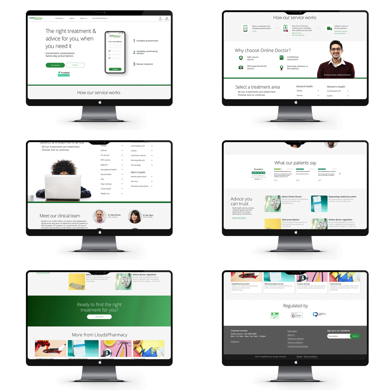
Pharmacy and Online Doctor were two separate systems, hard to navigate between, with people dropping off trying to cross from one to the other. Research moved the problem: trust and expectations were breaking down long before anyone reached the consultation.
That same research also pointed to something missing: some patients needed to speak to a doctor, not fill in a form. So alongside the redesign, we built Video Doctor. Drop-off in the consultation journey fell, Online Doctor and the pharmacy became one experience, and patients got a second way into care through Video Doctor — a service that didn’t exist before.
- ROLE.
- Lead Product Designer
- FOCUS.
- Product design · Service design · Healthcare UX · Research
Built around the form, not the patient
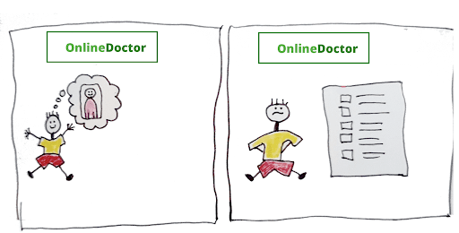
The original Online Doctor service was built largely around medical questionnaires. A patient selected a treatment, answered a series of questions, submitted the consultation and waited for a clinician to review it.
User research showed that many people did not really understand what they were buying. Some expected to speak directly to a doctor. Others did not understand why they were being asked very personal questions online, or that Online Doctor was a separate service from the pharmacy they thought they were already in. For some treatments, an additional step such as checking blood pressure at a pharmacy was required, but this part of the process was not always clear.
The problem was not simply that the forms were difficult to complete.
The service needed to explain itself better.
Research showed where trust was breaking down
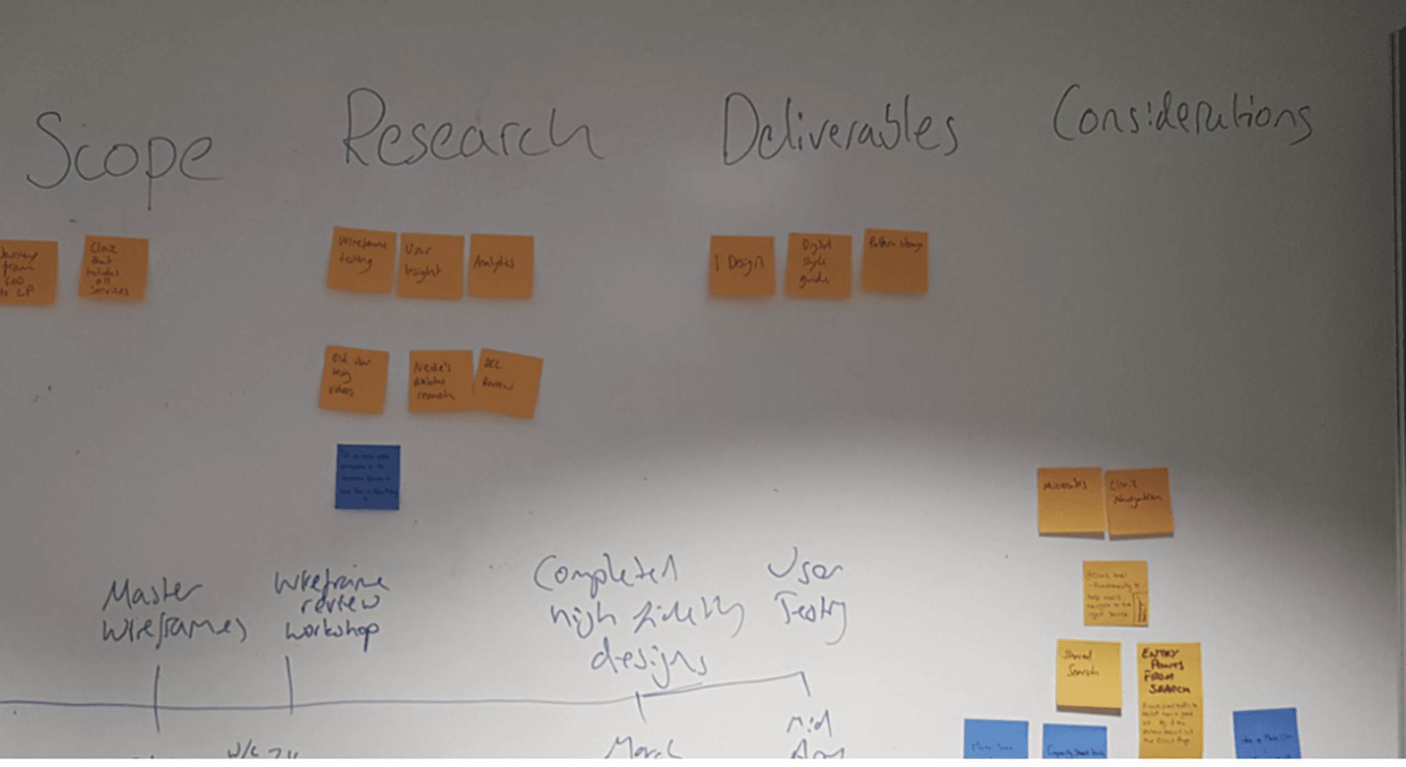
We combined existing product data with external user research, usability testing, competitor testing and prototype testing.
Three themes kept coming up.
“Online Doctor” meant different things to different people
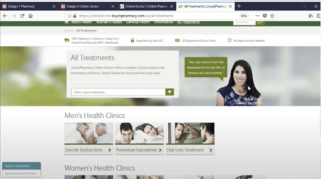
For some users, the name suggested a live appointment with a doctor and a service that could help with a broad range of health problems.
In reality, the service supported a defined set of conditions and most journeys were asynchronous: patients selected a treatment, completed a questionnaire and a clinician reviewed it later.
That mismatch affected expectations before the consultation had even started.
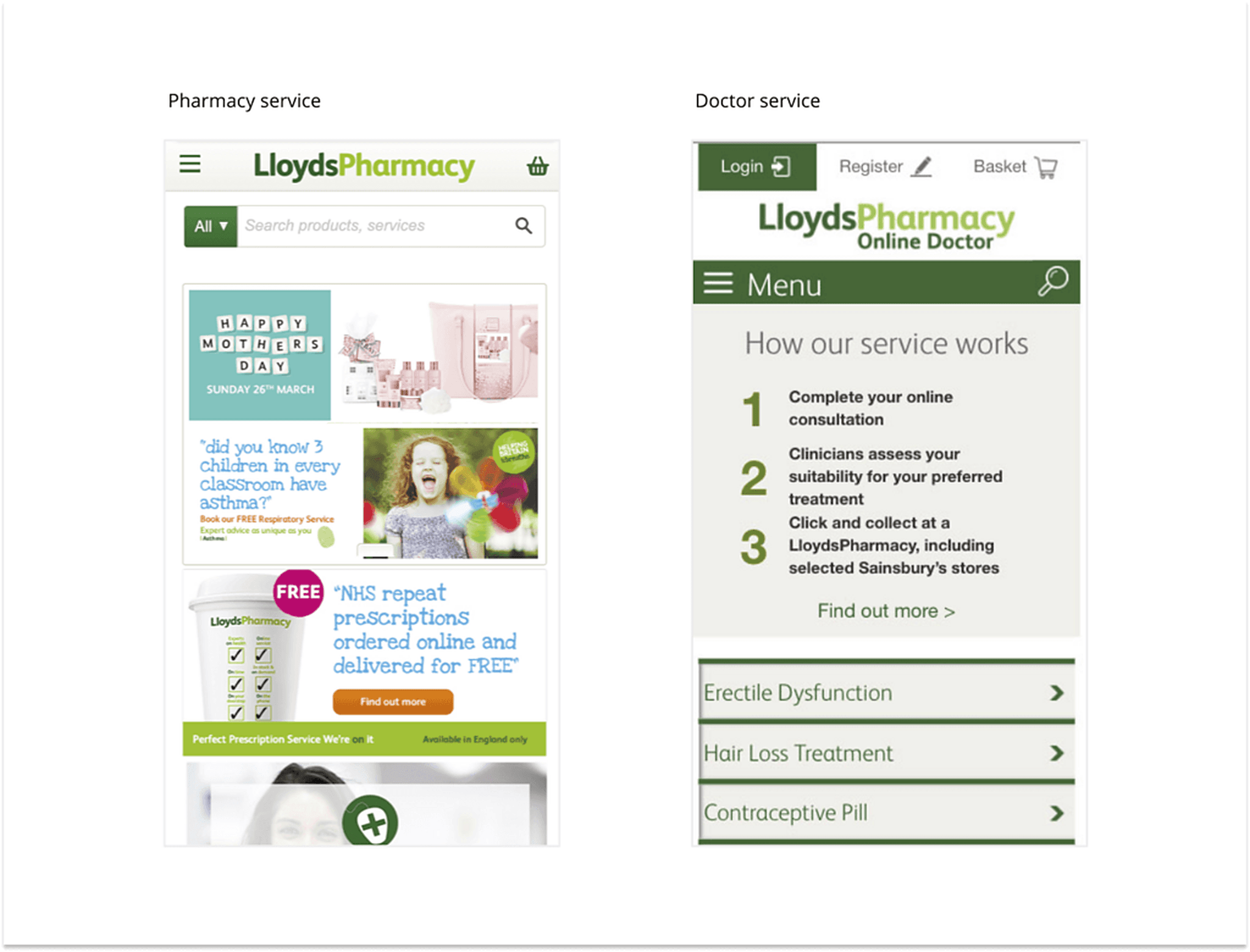
We also saw confusion between the Online Doctor service and the pharmacy experience. Users did not always understand that these were different parts of the wider journey, which made the service harder to follow and added to the uncertainty around what would happen next.
Sensitive questions needed context
The medical questions were necessary, but patients could not always see why specific information was being requested.
Without that context, even clinically valid questions could feel intrusive, unrelated or difficult to trust.
The digital journey wasn’t the whole journey
Some treatments included steps outside the product.
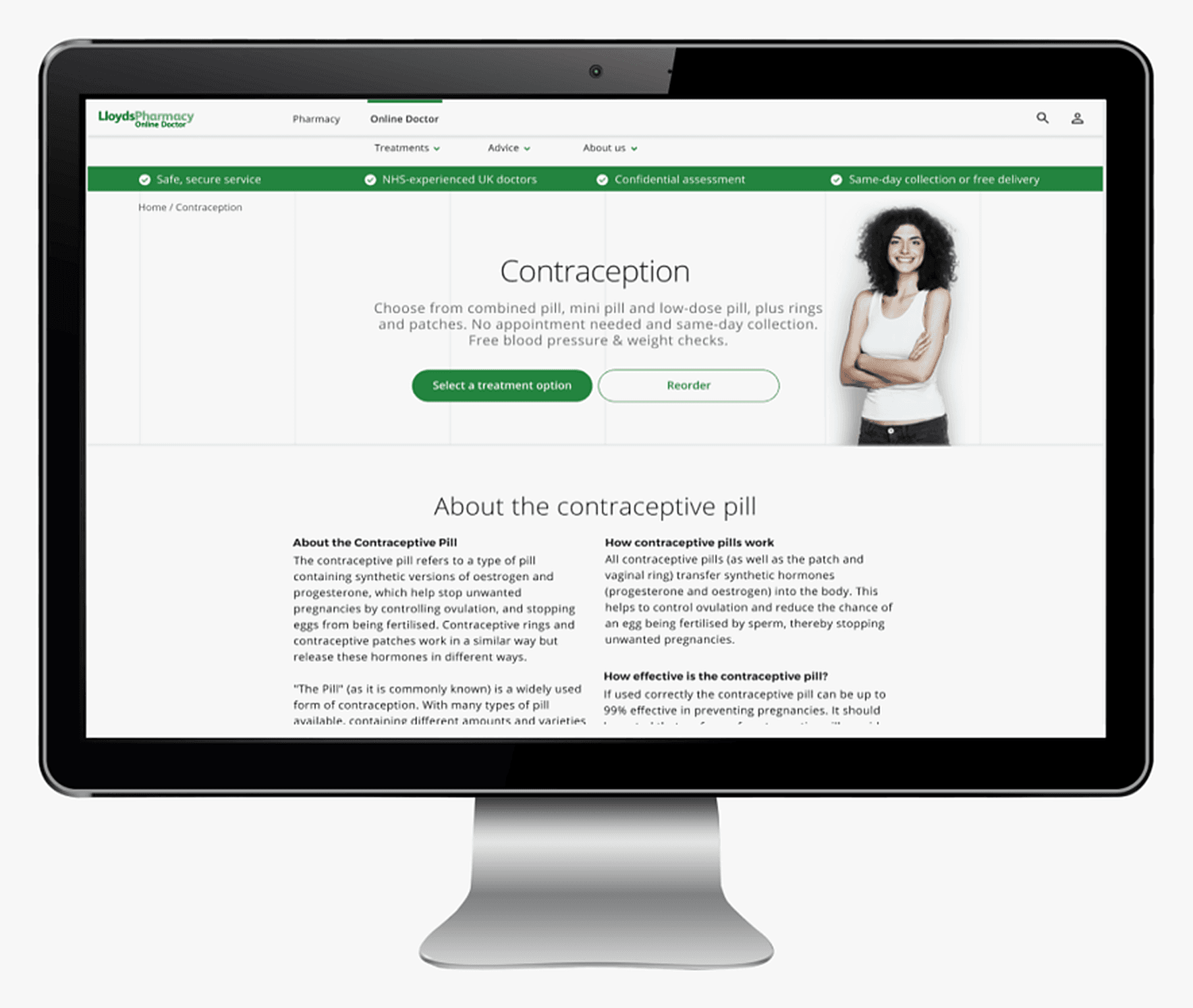
For contraception, for example, patients might need a blood-pressure measurement at a pharmacy. This was not always clear, and some users questioned whether an online service could really be safe when they were used to a doctor carrying out checks in person.
The offline and online parts of the experience needed to feel like one connected care journey.
From redesigning a questionnaire to redesigning the care journey
At first, the obvious problems were in the forms, but research changed the question we were asking.
People needed to understand what kind of healthcare service they were using, whether it was suitable for their problem, whether they would speak to a doctor, why medical information was required, what would happen after submission and whether they needed to complete anything offline.
Once we looked at the problem this way, the work became less about improving questionnaires and more about designing the complete patient journey.
Make the care model visible
The redesign gave patients more context before, during and after the consultation. Instead of treating the questionnaire as the product, we designed the surrounding journey to help people understand what they were doing, why it mattered and what would happen next.
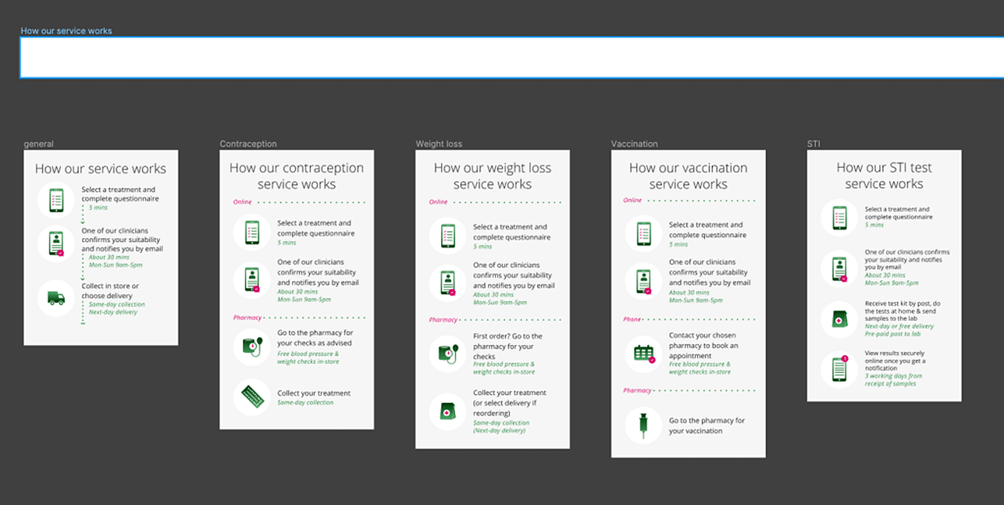
Set expectations before the questionnaire
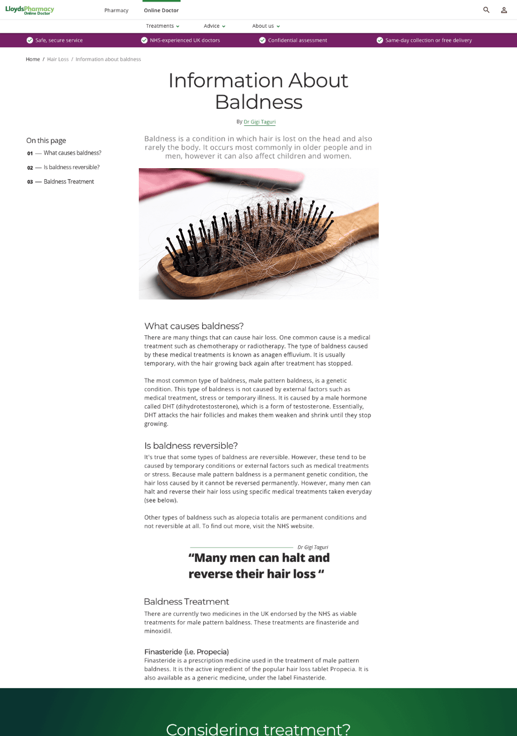
Treatment pages explained more clearly how each service worked, what information would be required and what would happen after submission. The aim was to reduce uncertainty before patients entered a long medical flow.
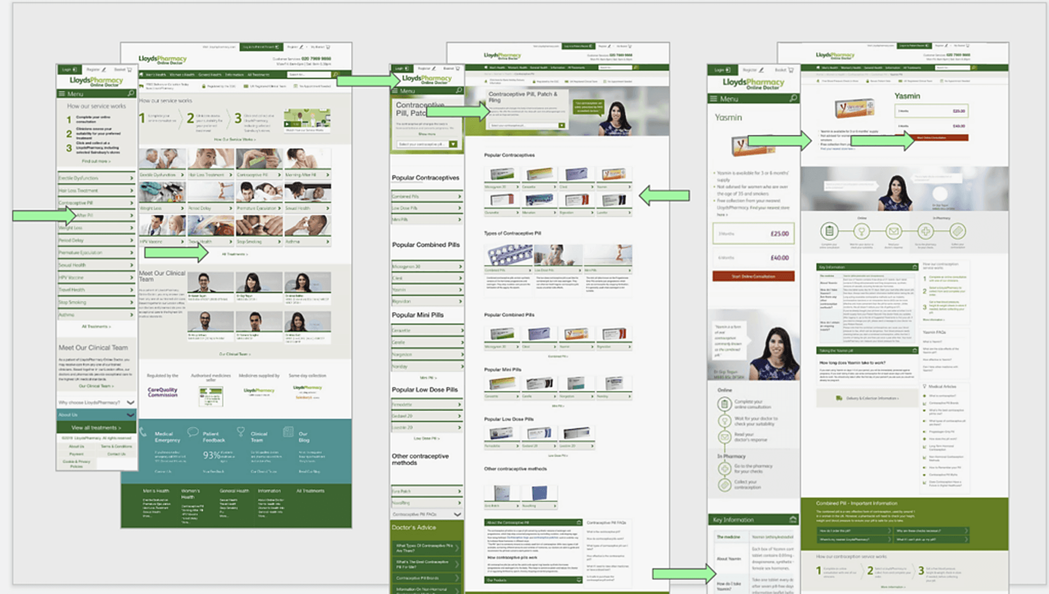
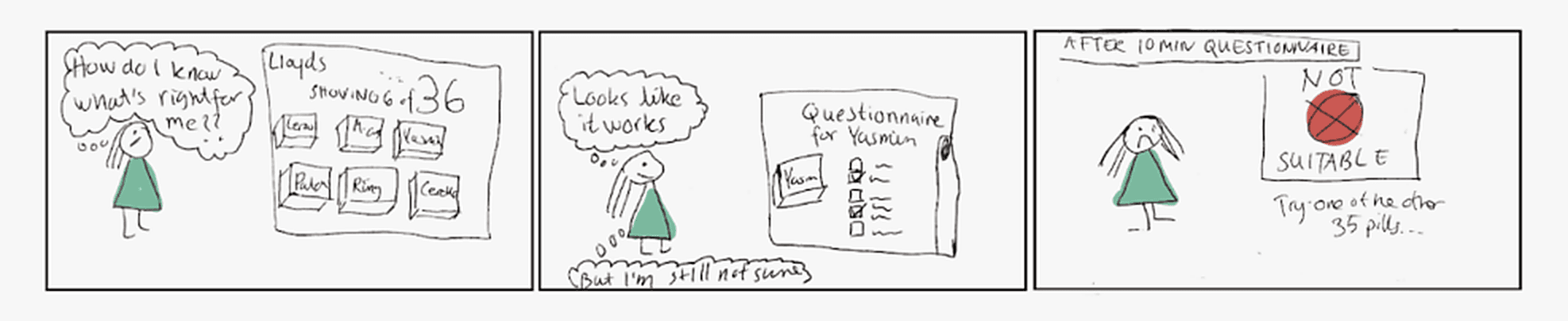
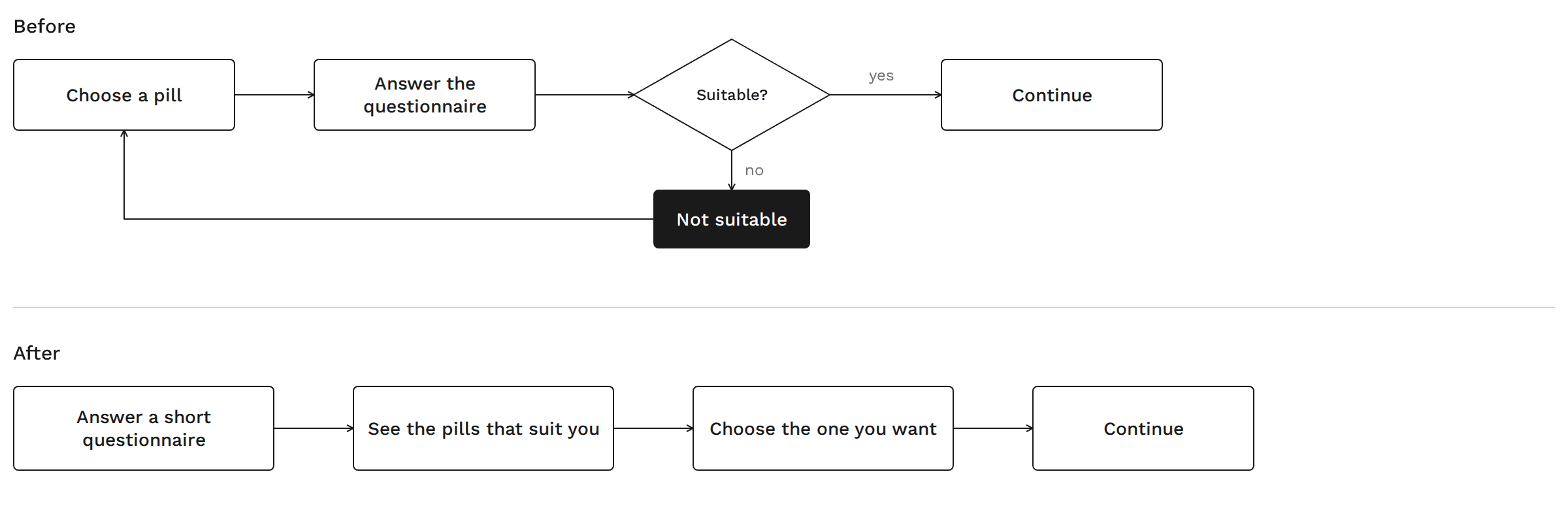
This was especially visible in contraception journeys. A patient could select a specific contraception option, work through a long medical questionnaire, and only then find out that the chosen option was not suitable for them. Although another option might still be appropriate, the experience could feel like a dead end after a significant amount of effort.
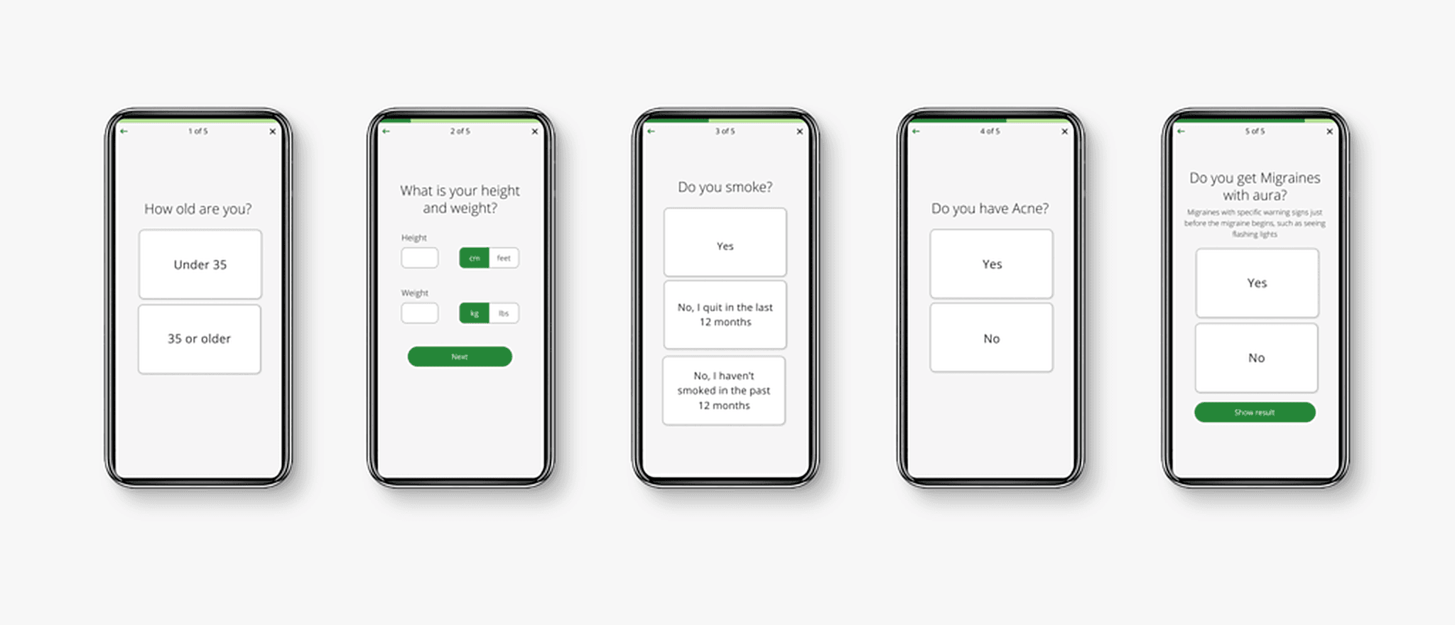
Because the underlying algorithm was difficult to change, we introduced a shorter “help me choose” step before the full medical questionnaire. Designed together with clinicians, this helped users identify a more suitable option earlier in the journey and reduced the risk of sending them down the wrong path from the start.

Explain why we’re asking
For more sensitive questions, we introduced additional context where appropriate. We could not simply rewrite medical language until it felt friendlier, because the wording still had to remain clinically accurate.
The design therefore had to make the reason behind the question clearer without changing its medical meaning.
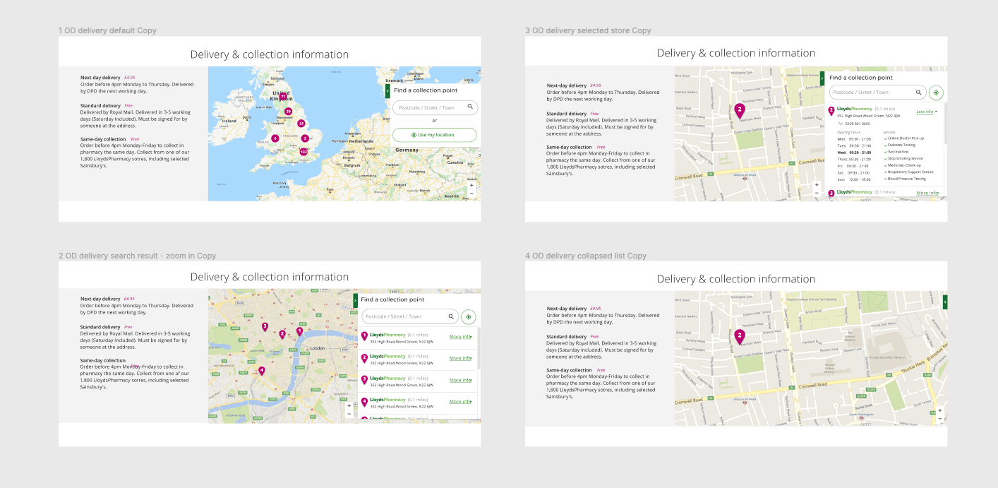
Treat offline care as part of the product
When a treatment required something outside the digital service, we made that part of the communicated journey. A pharmacy visit was no longer something the patient discovered later; it became another visible step in the treatment process.
Make long journeys easier to follow
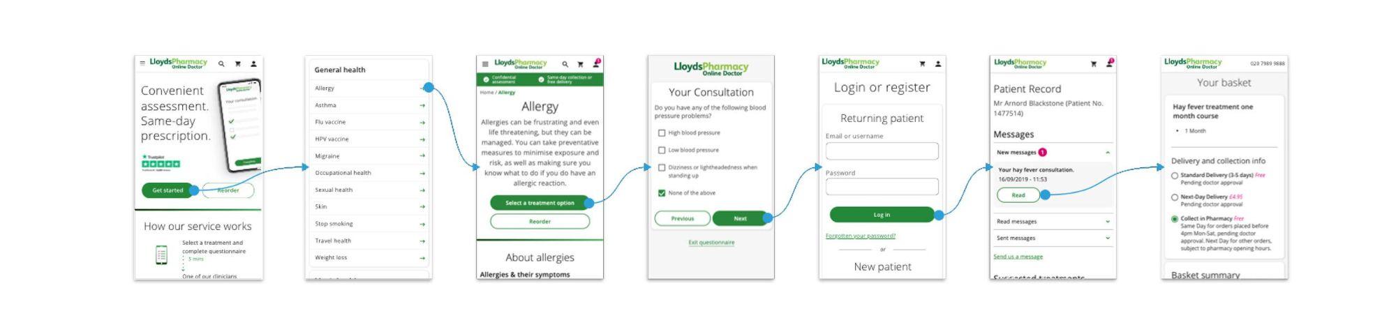
We broke long questionnaires into clearer stages, with stronger hierarchy, progress indicators and simpler interactions.
The goal was not always to make the medical process shorter. It was to make the process easier to understand and follow.
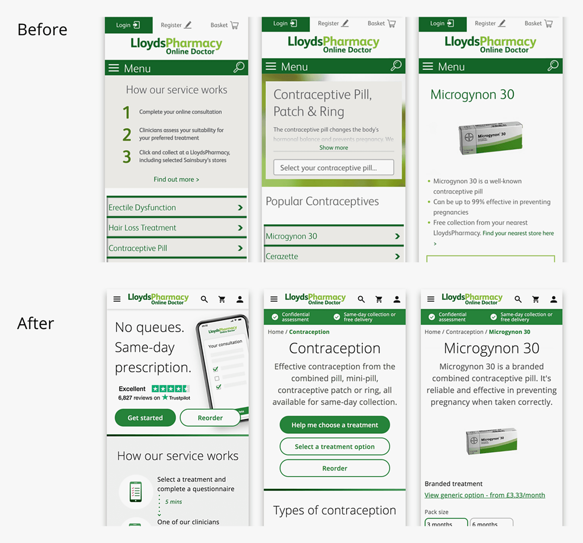
Make Online Doctor and the pharmacy feel like one service
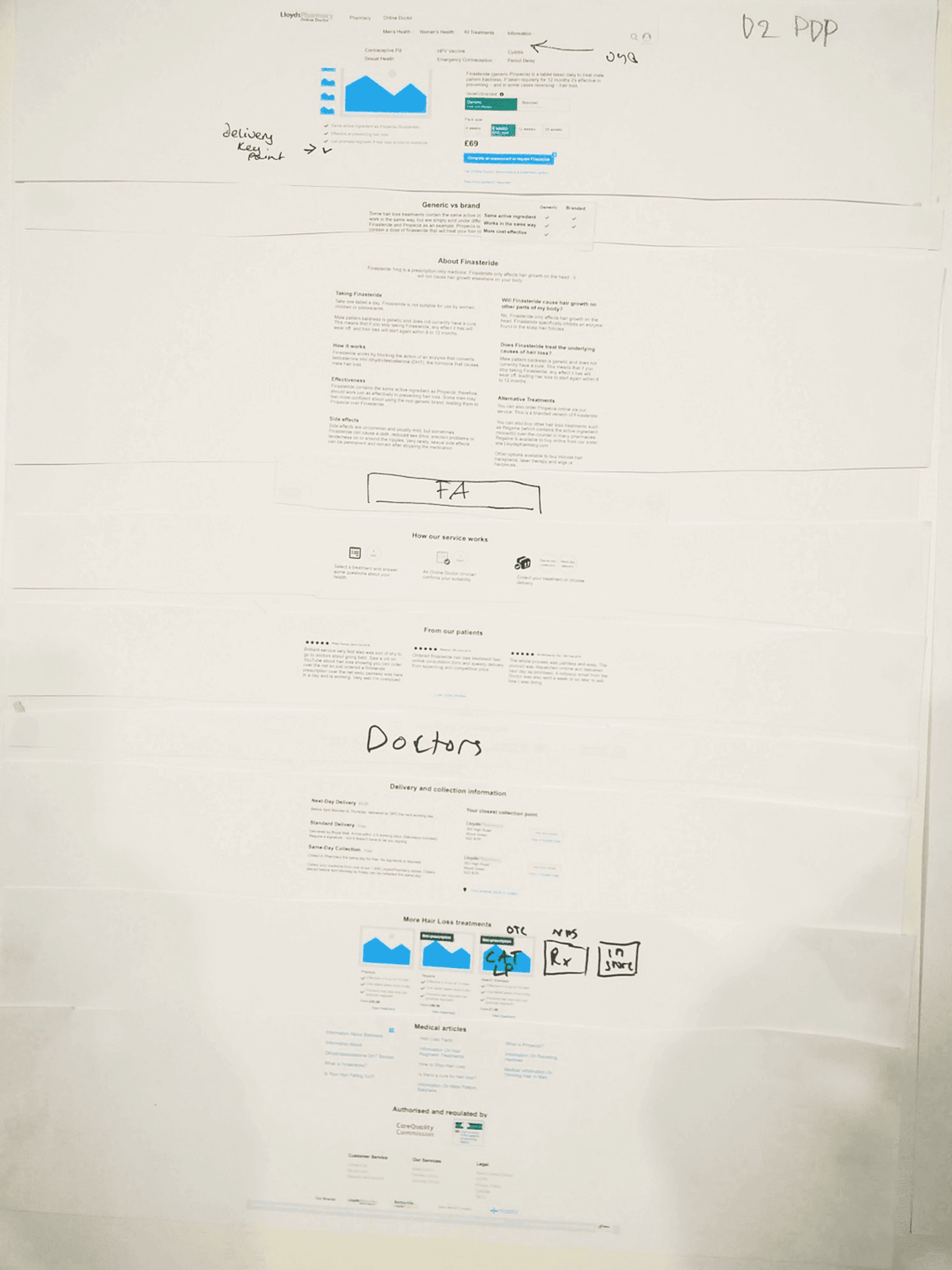
When we asked people in testing to find Online Doctor, they went to the pharmacy site and could not find their way back. The two were separate platforms with no real connection between them, so people got lost moving from one to the other.
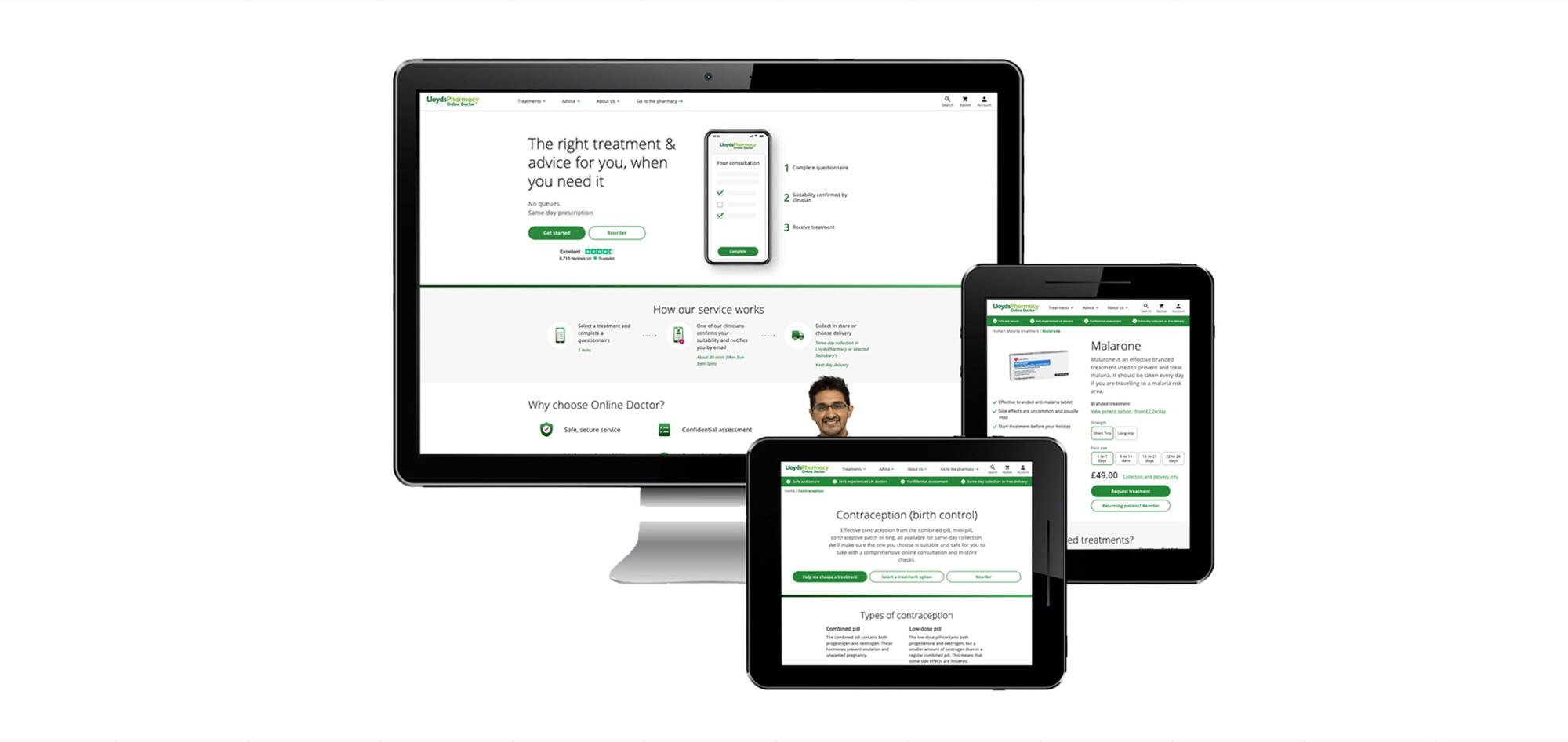
We redesigned both with the same look, feel and components, and linked them across, so that moving between them felt like one service. It was a big piece of work to get through.
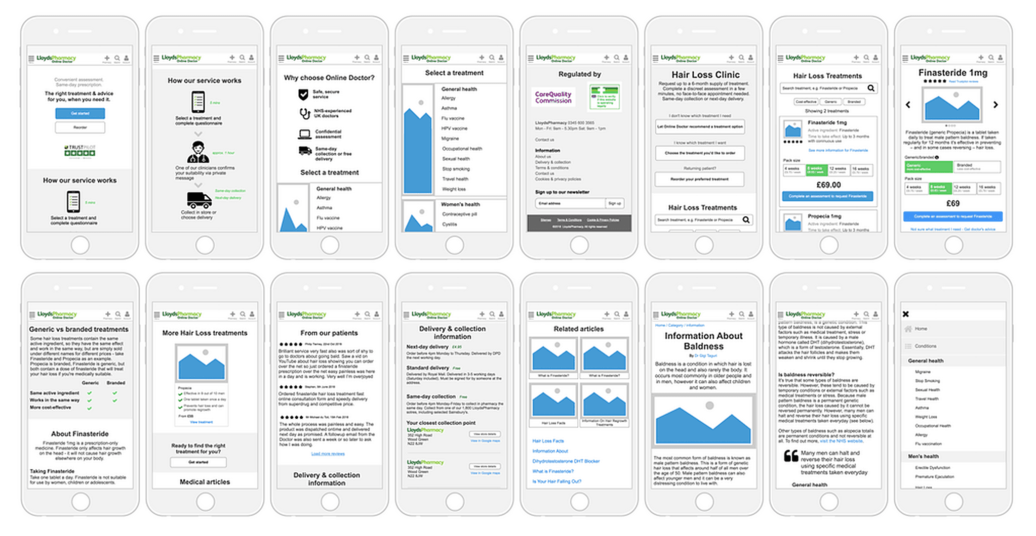
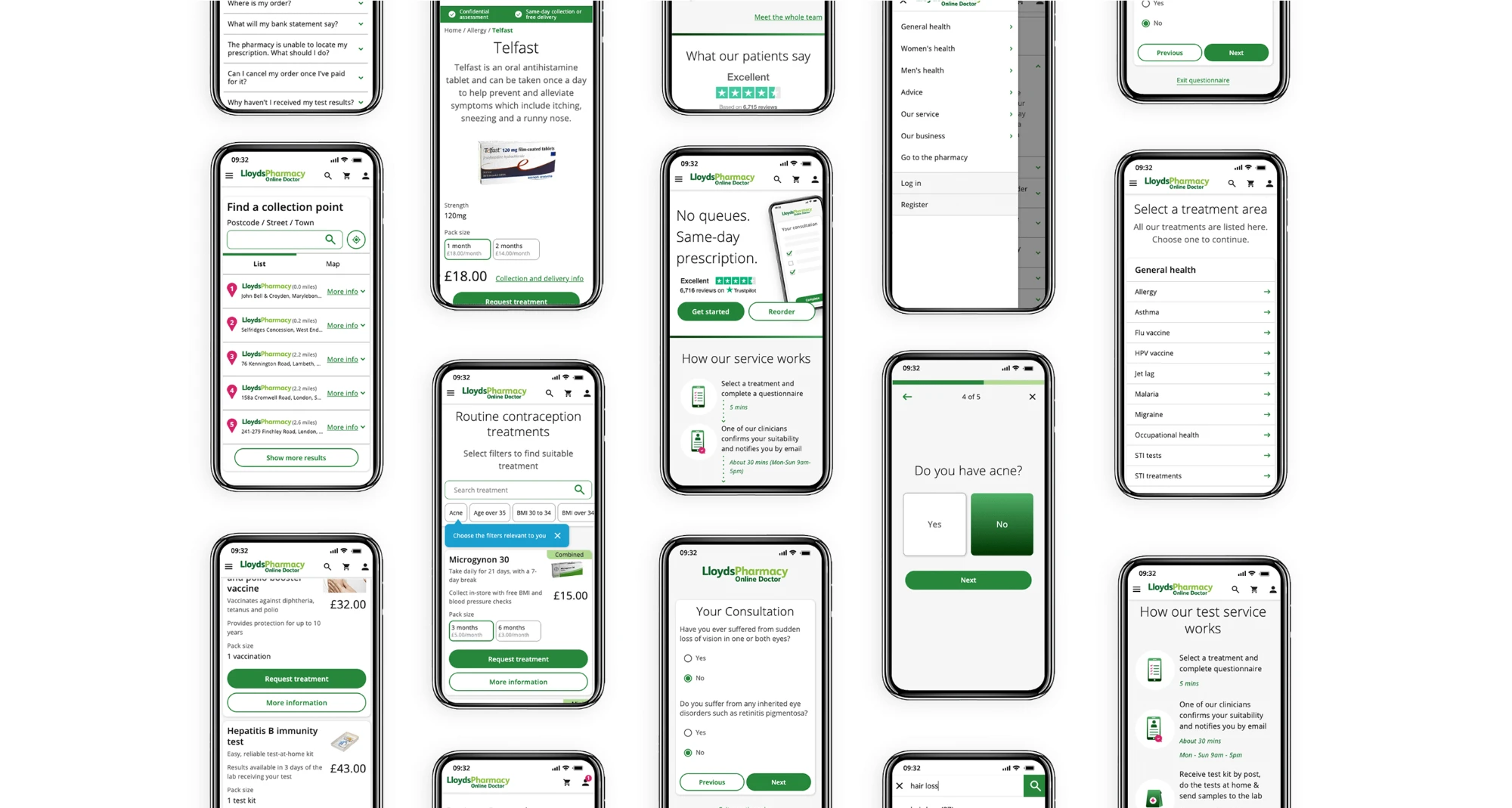
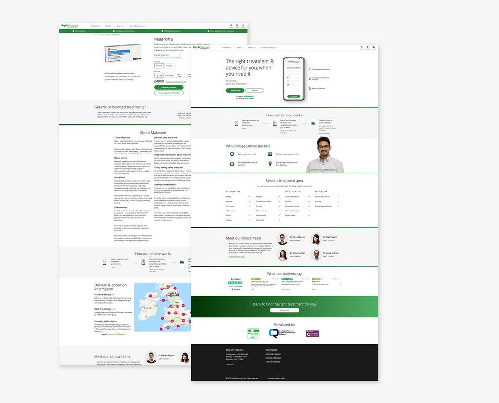
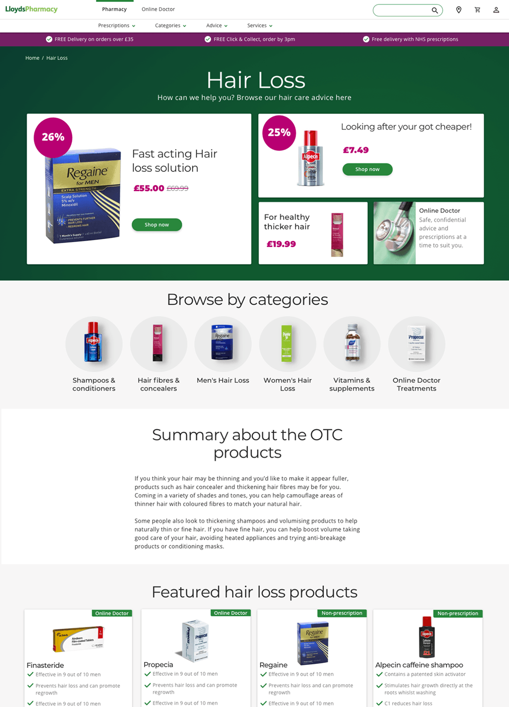
Testing the prototype showed trust still needed more
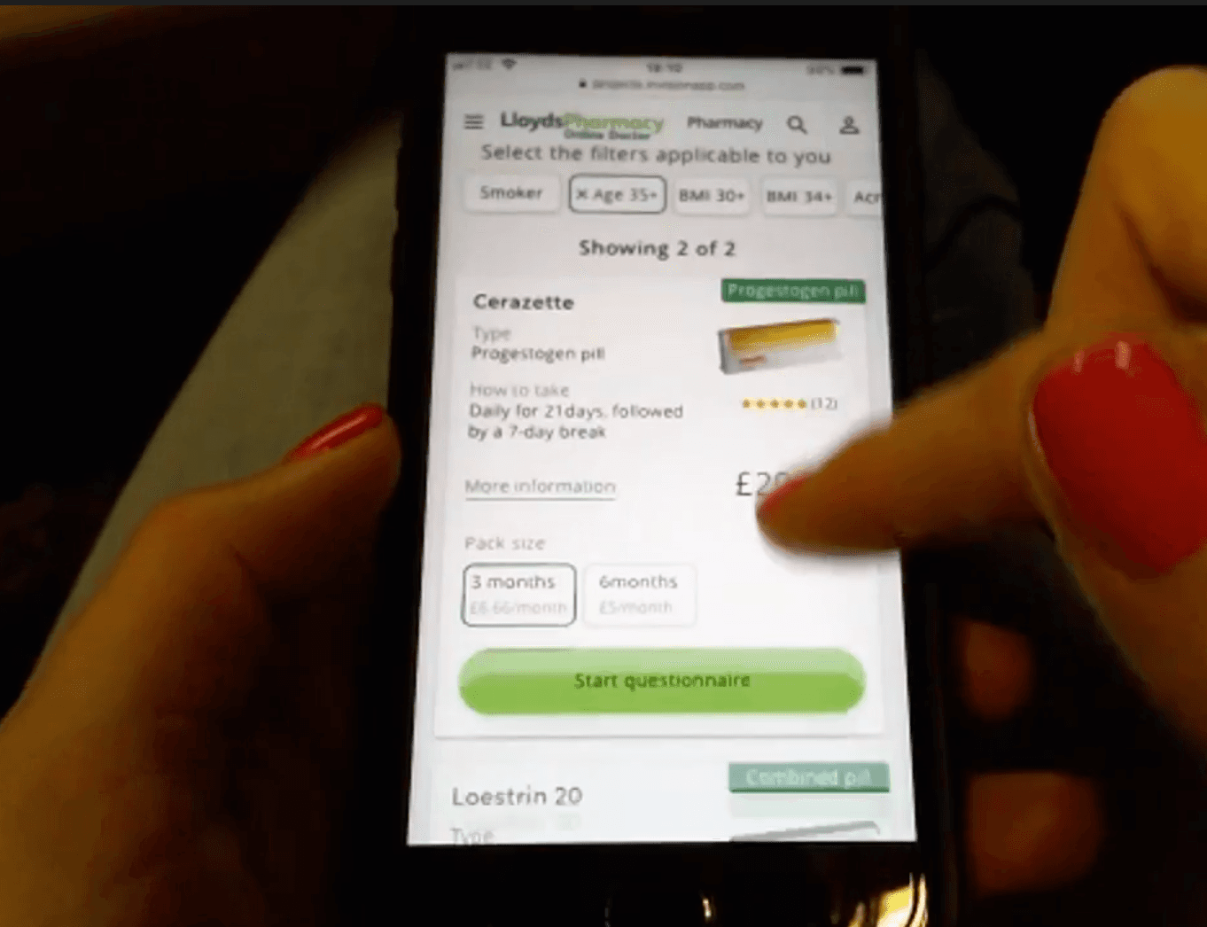
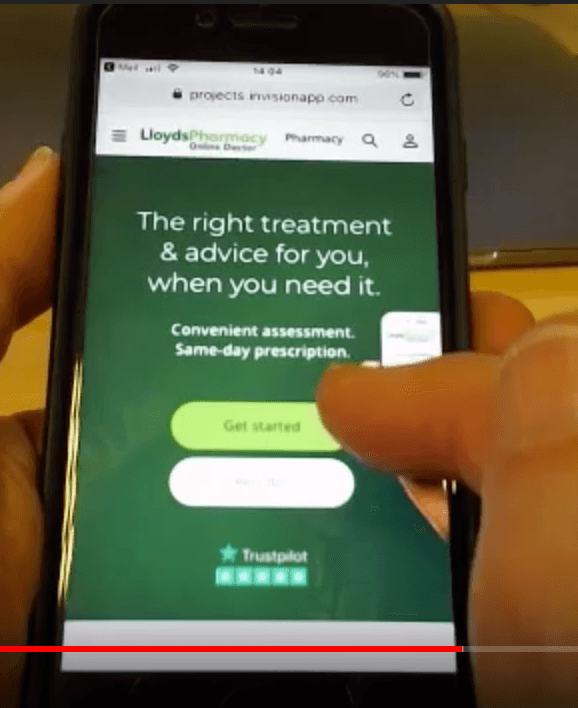
Before anything was built, we tested the prototype with users.
People still needed more reason to trust the service. They wanted to see more of the people behind it, and they needed a better understanding of how it worked and how to use it.
Testing also confirmed the navigation problem from the research: the pharmacy and Online Doctor still felt like two disconnected places.
We took those findings back into the design before build.
Designing with clinical constraints
Healthcare changed what “simplification” meant.
Sometimes a question could not be removed. Sometimes wording could not be shortened. Sometimes additional steps existed because they protected the patient.
I worked closely with clinicians and other stakeholders to understand where we could simplify the experience and where medical accuracy, regulatory requirements or patient safety needed to take priority.
The challenge was to distinguish the complexity required by healthcare from complexity created by the product itself.
Research uncovered a second product opportunity
One finding kept appearing in the research: some users already believed Online Doctor meant speaking remotely with a doctor.
The service did not offer this, but the expectation revealed a genuine need.
Some healthcare journeys worked well through an asynchronous questionnaire. Others were easier to understand, more reassuring or more appropriate as a conversation with a doctor.
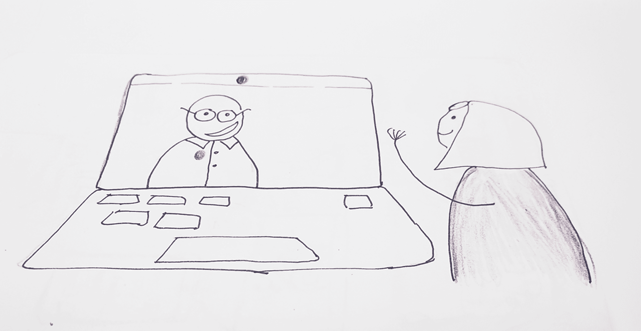
That led to the development of a Video Doctor MVP.
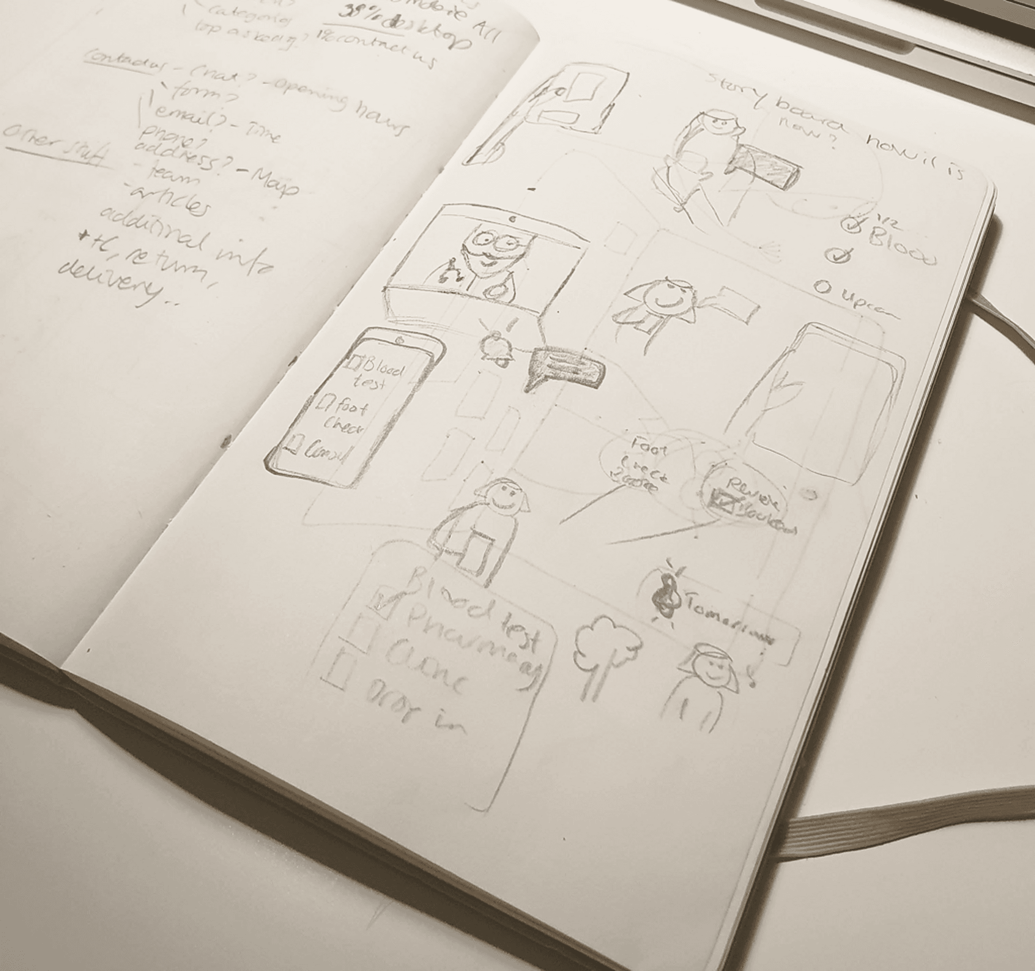
Helping patients reach the right kind of care
The video service did not already exist, so we had to define how it should fit into the wider healthcare experience.
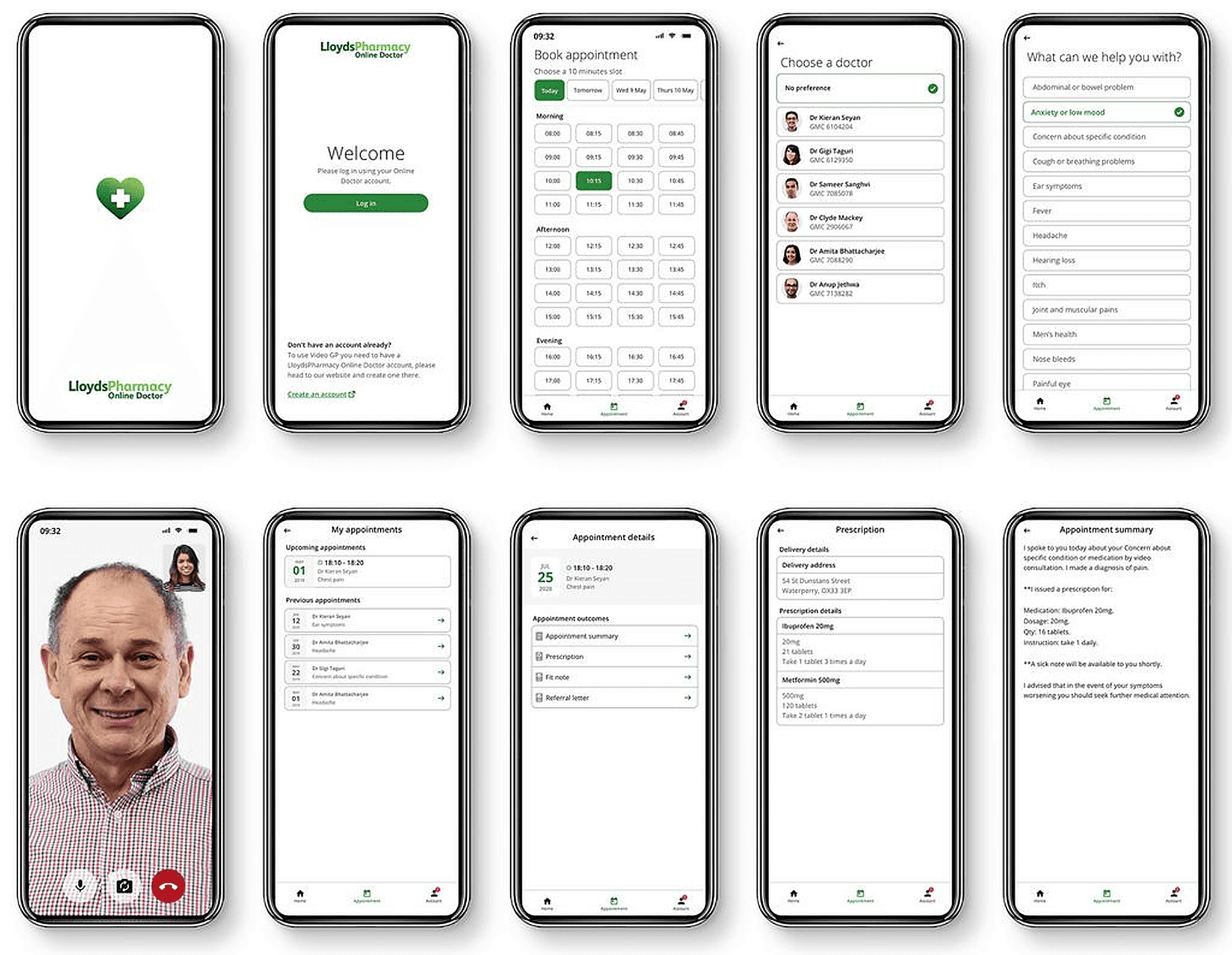
The product needed to help patients understand which type of care was appropriate and guide them to the right path. Depending on the treatment, that could mean continuing with an online questionnaire or booking an appointment with a doctor.
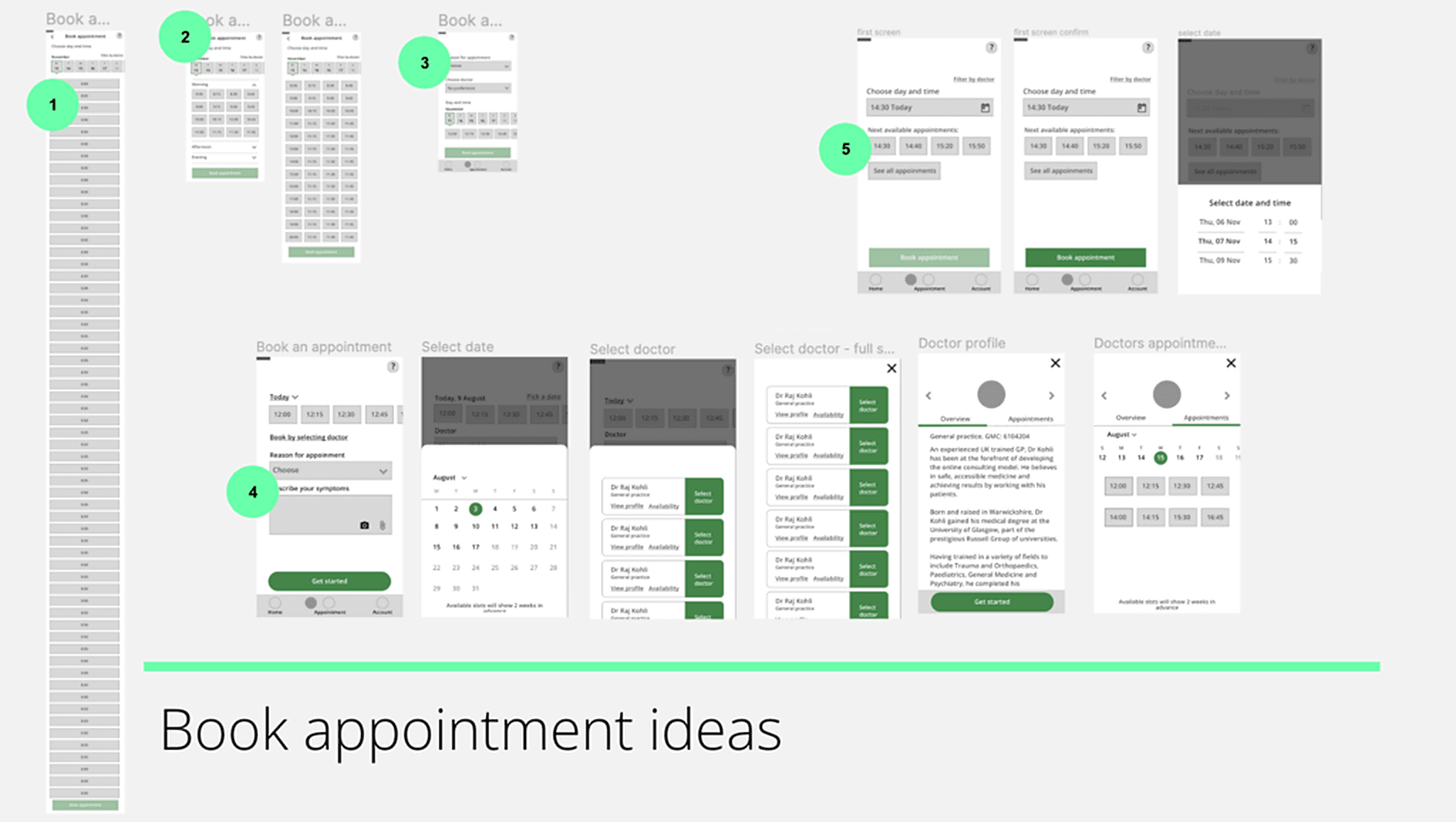
I worked on the experience around choosing the appropriate type of consultation, finding an available appointment, booking a doctor, preparing for the consultation and understanding what happened before and after it.
The aim was not to create two separate products. It was to give patients different ways to access the same healthcare service.
The research changed the question from:
How do we improve the questionnaire?
to:
What is the right way for a patient to access care for this particular problem?
For some treatments, a structured questionnaire was efficient and appropriate. For others, speaking with a doctor made more sense.
The product needed to guide patients to the right type of care without expecting them to understand the healthcare model first.
What changed
A clearer service model
Patients received more context around what the service was, how it worked and what would happen next.
Trust became a design priority
Before asking users to go through a long medical process, the service needed to feel credible, understandable and safe enough to continue with.
Questionnaires became part of a wider care journey
We stopped treating forms as isolated tasks and designed around the complete treatment process.
Online and offline care became more connected
Steps such as pharmacy visits were brought into the communicated patient journey rather than treated as external details.
Fewer people dropped out of the contraception journey
Answering a short questionnaire first, then choosing from what suited them, meant a lot fewer people reached the end of a long questionnaire only to be told their pill was not suitable.
Online Doctor and the pharmacy became one experience
Both sites shared a look, feel and set of components, and linked to each other, so people could find their way between them.
Users found their way
The redesigned service got good feedback from users, who could find what they were looking for in a service that had been outdated and hard to navigate.
Research led to a new care model
Insights from the redesign contributed to the Video Doctor MVP, giving patients another way to access care when a questionnaire was not the most appropriate interaction. It launched and was well adopted.
What I took from it
This project changed how I think about complexity.
In healthcare, simplifying a product does not always mean removing steps or shortening content. Some complexity is necessary because it protects the patient.
The designer’s job is to understand which complexity belongs to the healthcare process and which has been created by the product itself.
The biggest shift came when we stopped treating trust as something we could add through clearer copy or a cleaner interface. Patients needed to understand the healthcare model itself: what kind of care they were receiving, why information was needed, what would happen next, and where digital care connected to doctors and pharmacies.